
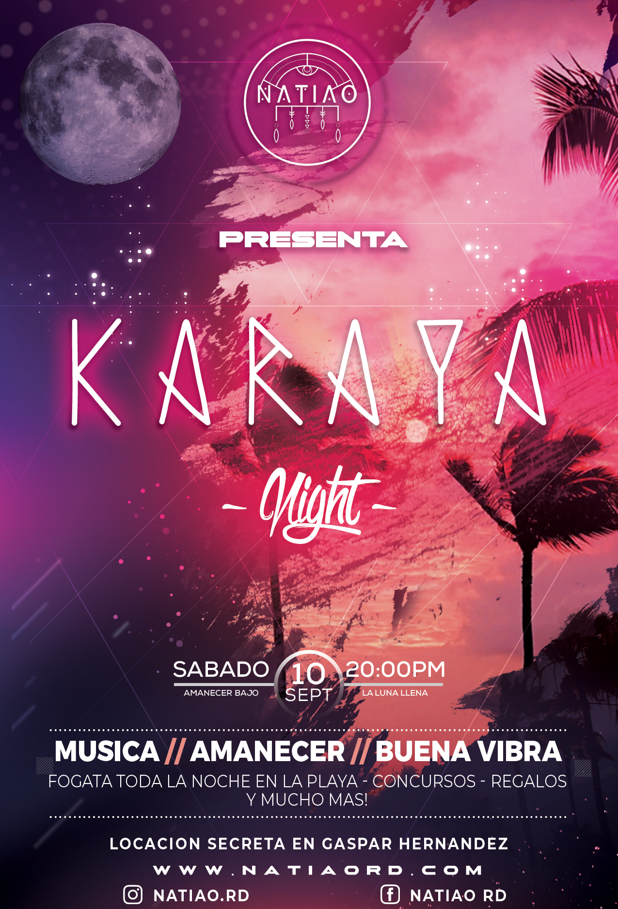
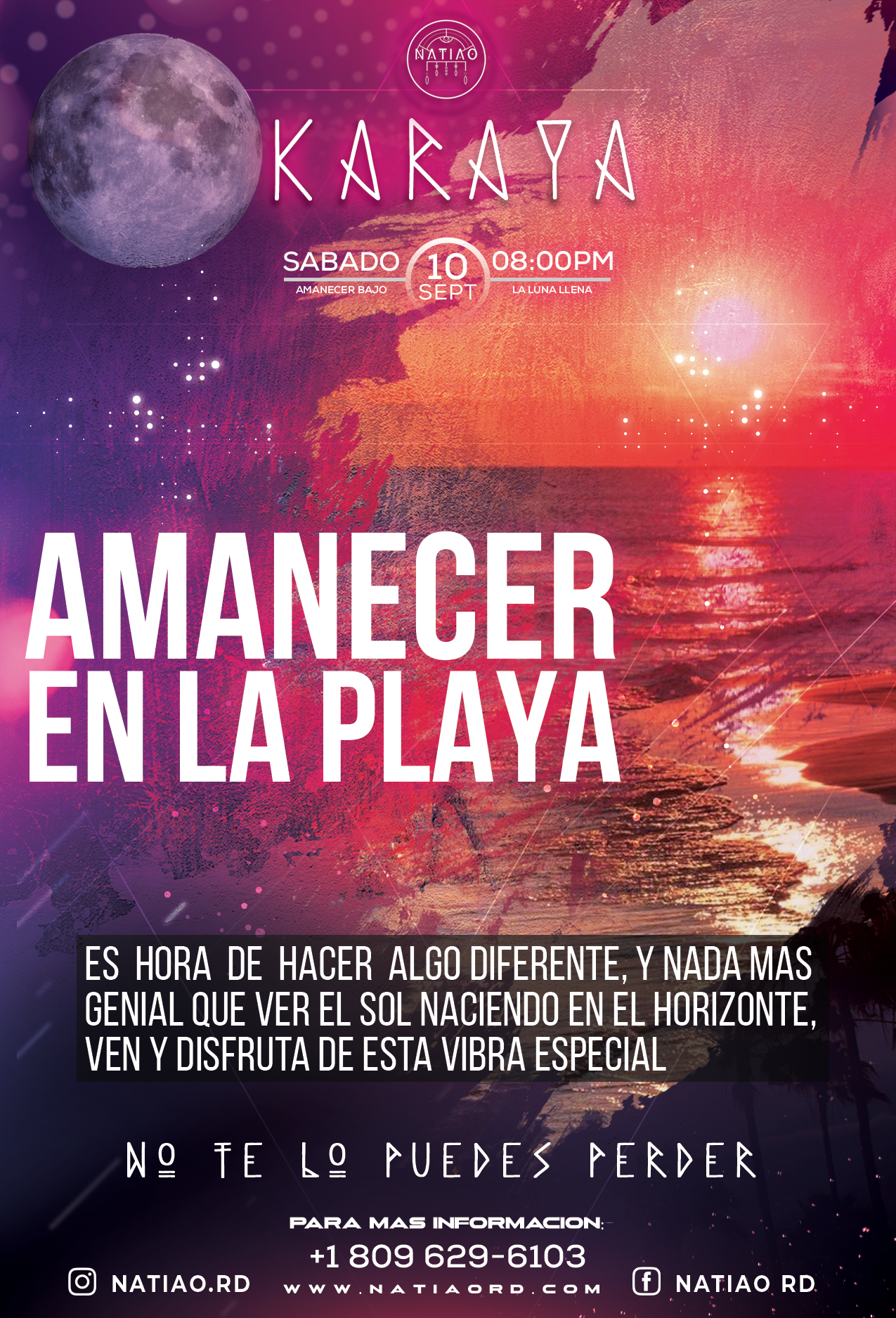
Project: Karaya Night
Through a wide variety of mobile applications, we’ve developed a unique visual system.
- Client NATIAO
- Date 01 Aug 2022
- Services Graphic Designer, Video Creator & Event Marketing Strategist
- Budget $20000+
Inbio is a all in one personal portfolio WordPress theme. You can customize everything.
Digital marketing and project management specialist with over 13 years of experience in customer service, sales, online marketing, and digital profile management. Expertise in launching and positioning products on platforms like Amazon FBA, as well as conversion strategies and marketing for social media profiles. Strong technical skills in programming, website creation, and managing advertising campaigns across multiple platforms.
Expert in developing cohesive brand identities that resonate with target audiences. Skilled in creating visual and verbal branding elements, including logos, taglines, and marketing materials. Experienced in implementing brand strategies across various platforms to ensure consistency and enhance brand recognition.
Skilled in building dynamic, responsive websites using technologies like React, WordPress, HTML, and CSS. Experienced in front-end development, creating user-friendly interfaces and optimizing website performance. Proficient in implementing SEO best practices and integrating third-party tools to enhance functionality and user experience.
Experienced in developing and executing comprehensive digital marketing strategies across various platforms. Skilled in SEO, PPC, social media marketing, and content creation to drive brand awareness and lead generation. Proficient in using data analytics and performance metrics to optimize campaigns, increase engagement, and achieve measurable business outcomes.
Experienced in developing cross-platform applications with a focus on user-centric design and functionality. Proficient in using programming languages like Java and Python to create scalable and efficient mobile and web applications. Strong understanding of integrating APIs and implementing responsive, high-performance features.
Experienced in planning, executing, and optimizing advertising campaigns across platforms like Meta, TikTok, YouTube, and Google Ads. Skilled in audience targeting, budget management, and A/B testing to maximize ROI. Proficient in analyzing performance metrics to refine strategies, boost engagement, and drive conversions.
Proficient in creating intuitive and visually engaging user interfaces with a focus on enhancing user experience. Skilled in wireframing, prototyping, and user testing to develop responsive and user-friendly designs. Experienced in translating user needs and business goals into effective design solutions that improve usability and engagement.
Google’s hiring process is an important part of our culture. Googlers care deeply about their teams and the people who make them up.
Led the launch and ranking optimization of products on Amazon. Implemented digital marketing strategies, ad campaigns,and product optimization. Achievements: Increased sales by 50% in the first year and positioned products in the top 10 in the personal care category.
Implemented effective sales strategies, developed training programs for the team, and strengthened key client relationships. Achievements:Increased sales by 45% in the first year and positioned the company as a leader in the life insurance market.
Through a wide variety of mobile applications, we’ve developed a unique visual system.
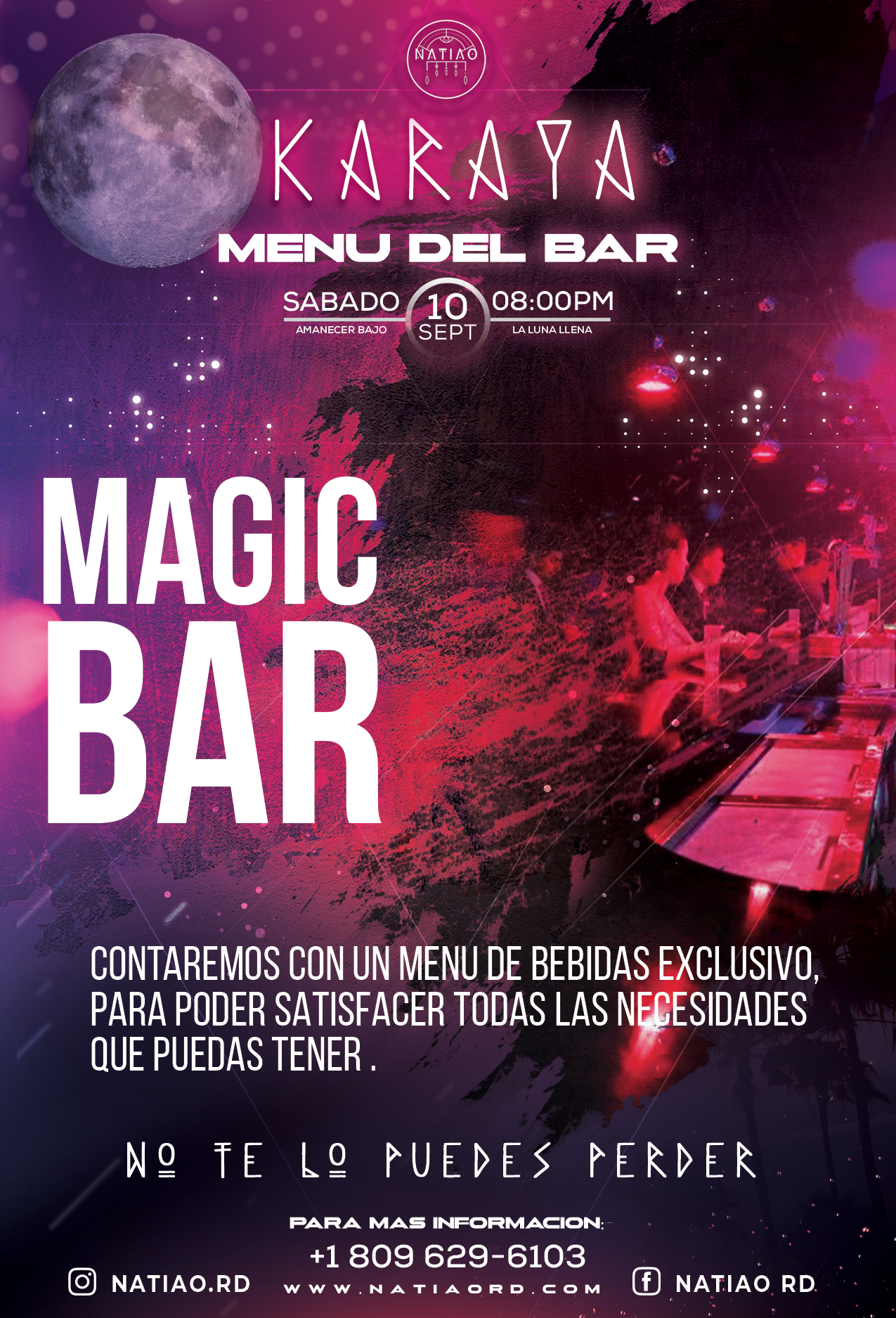
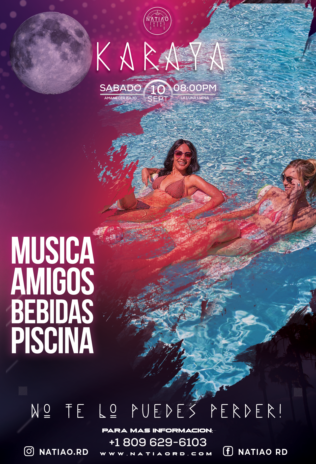
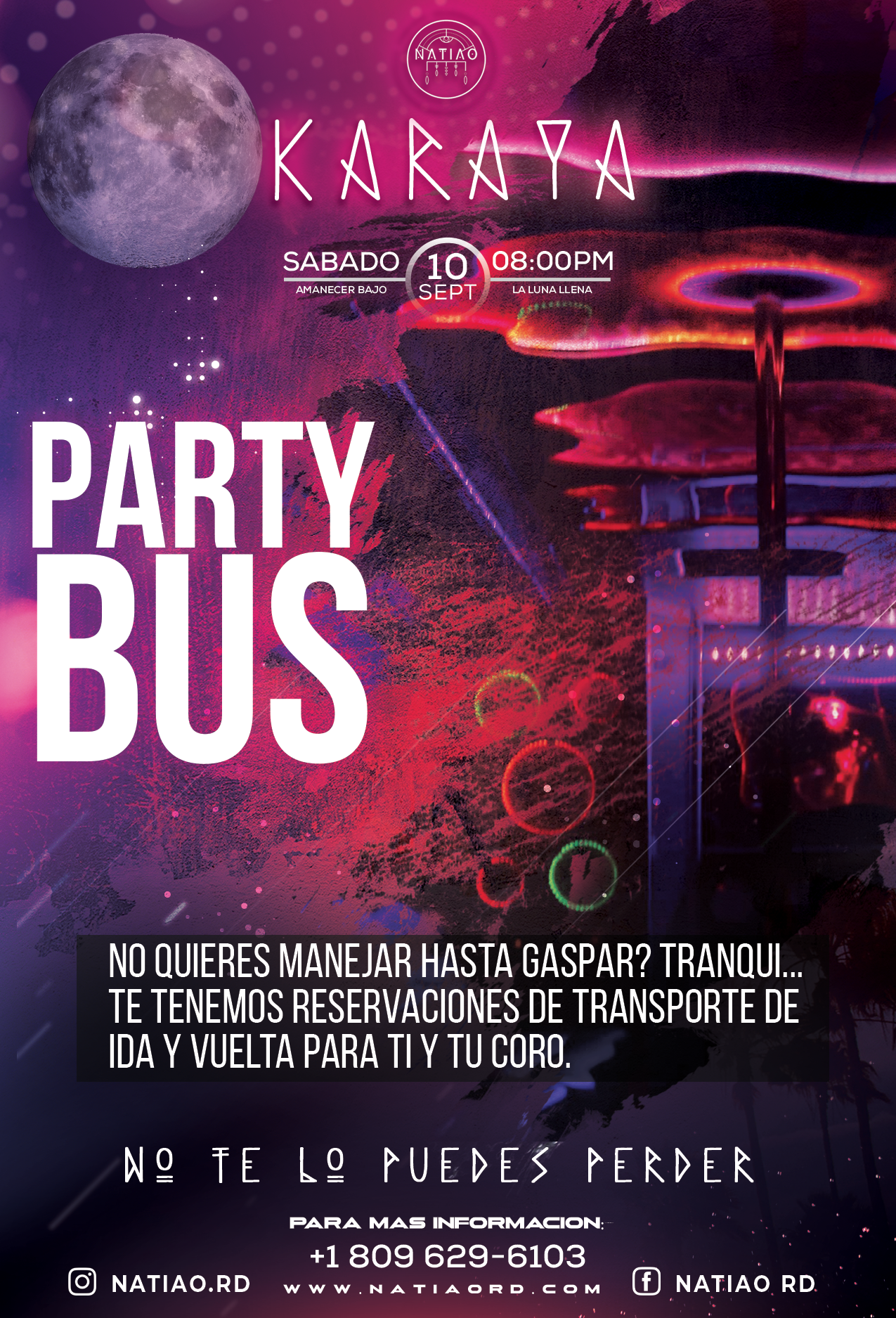
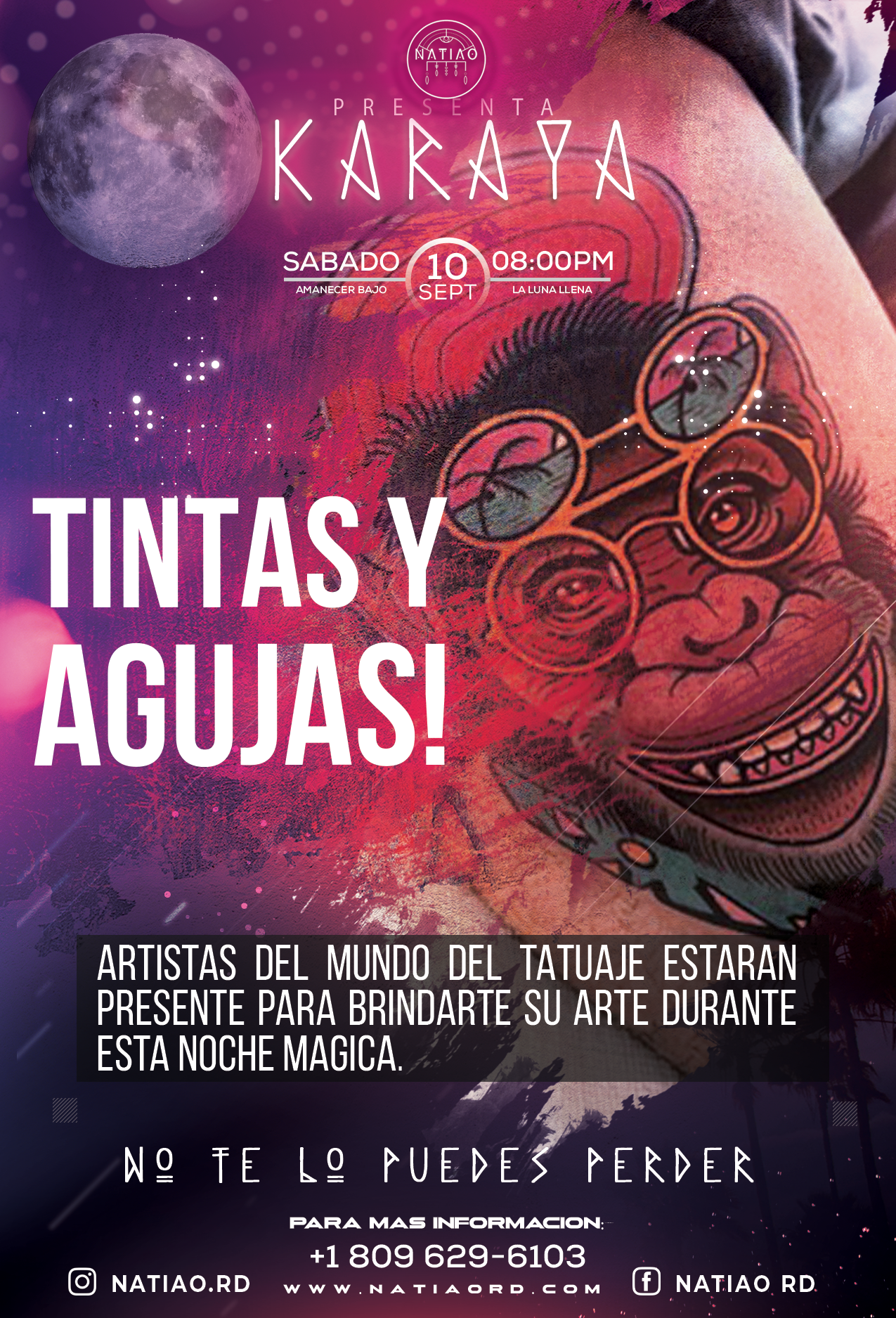
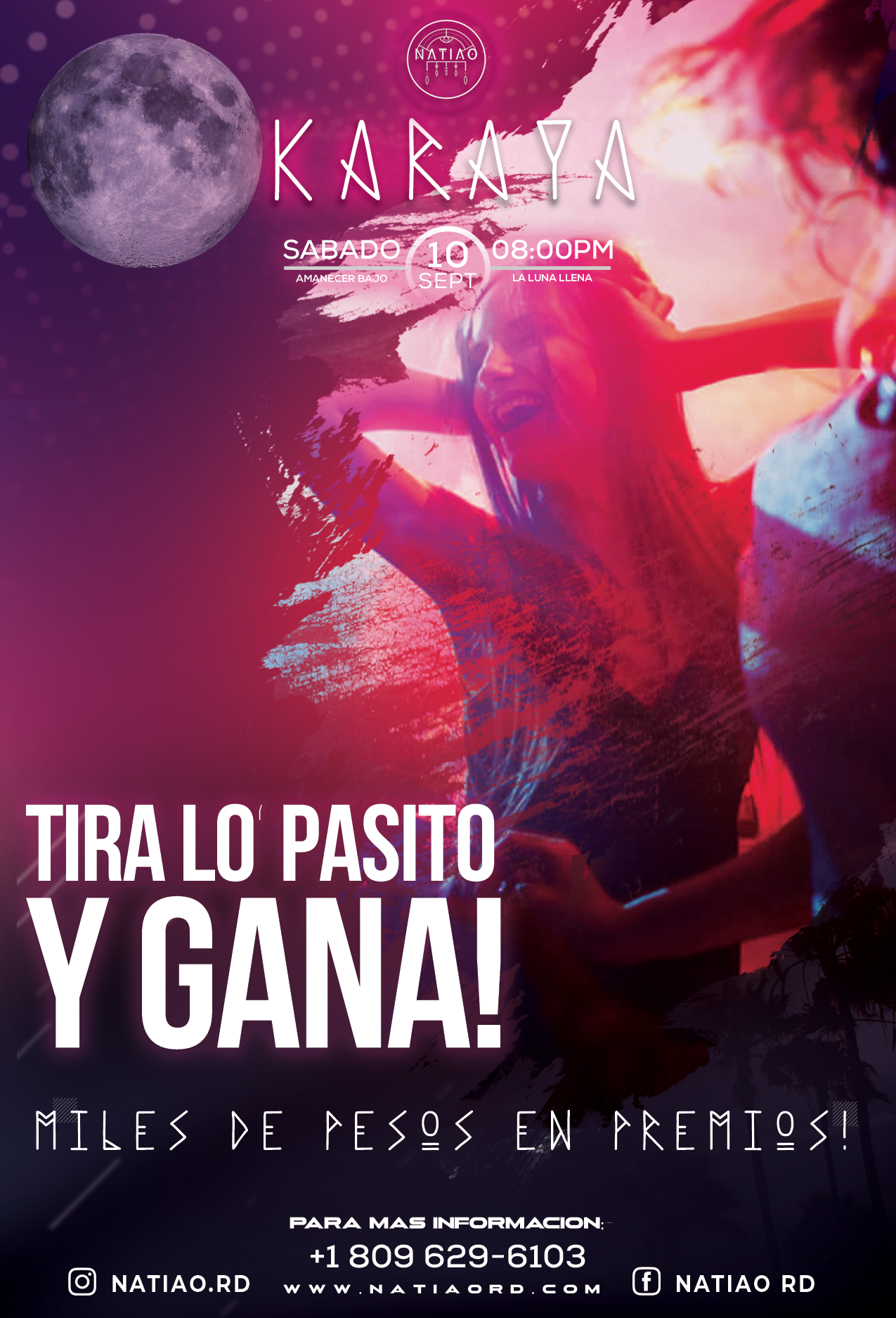
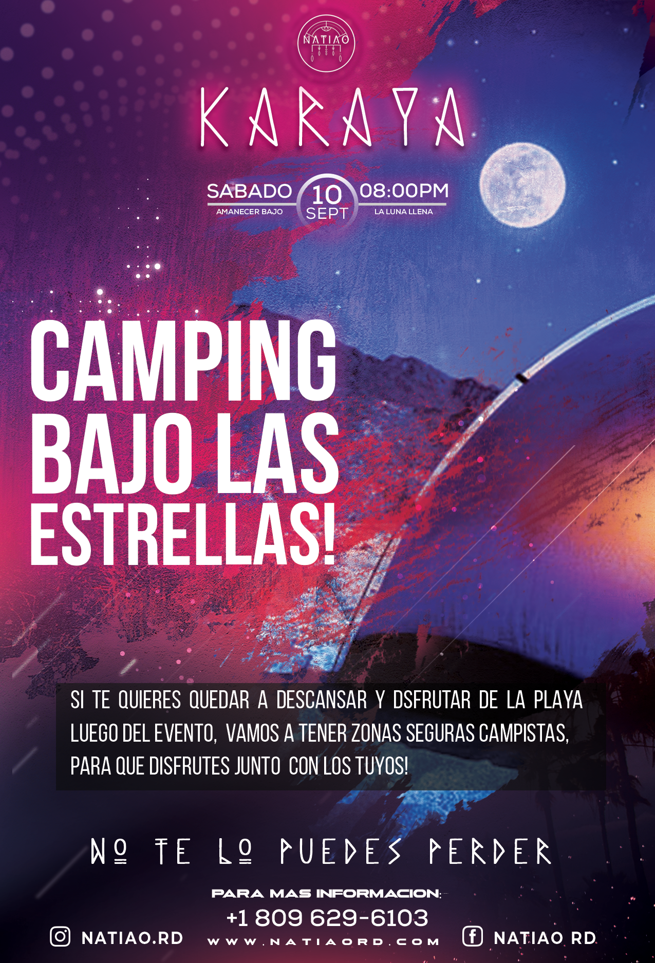
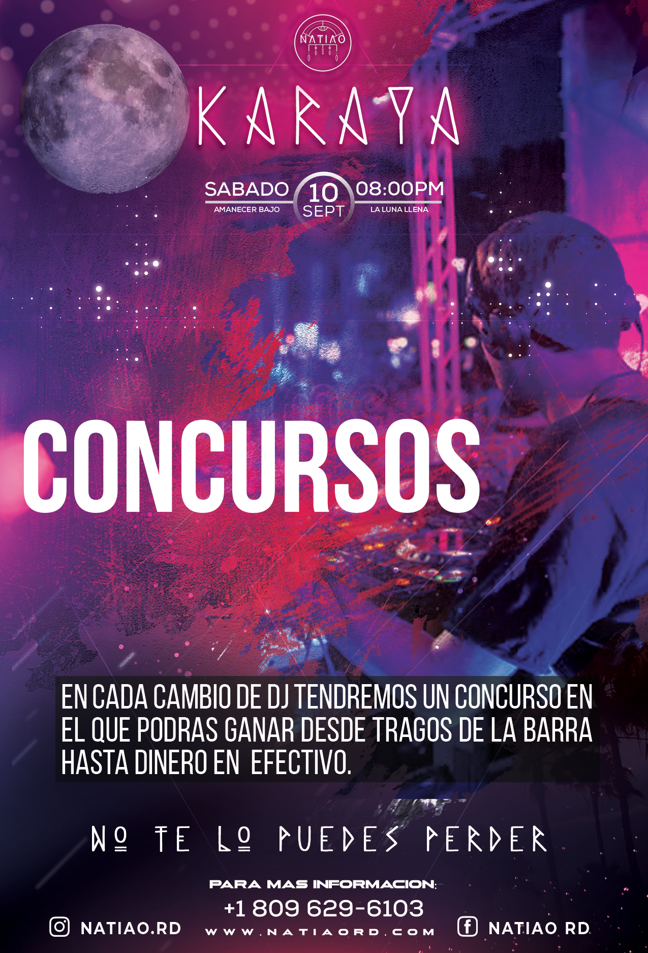
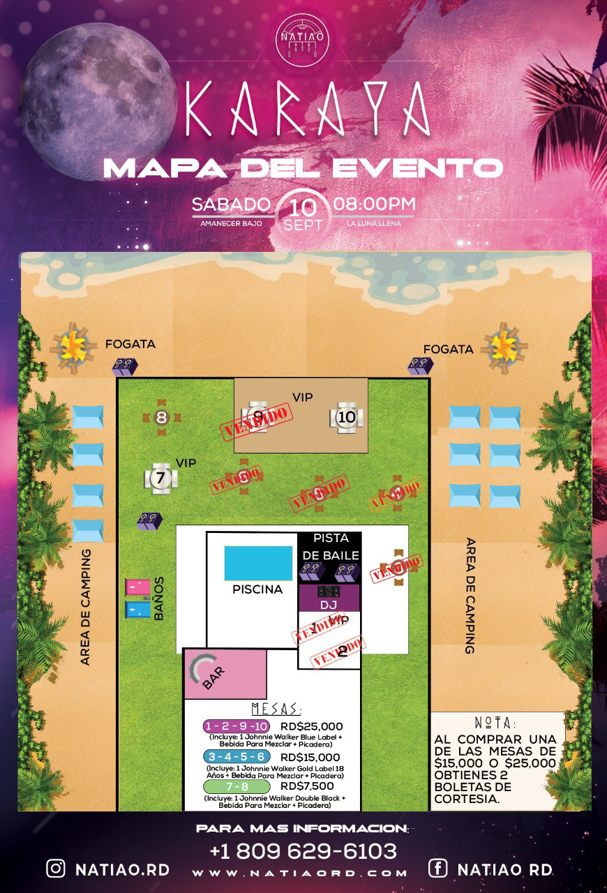
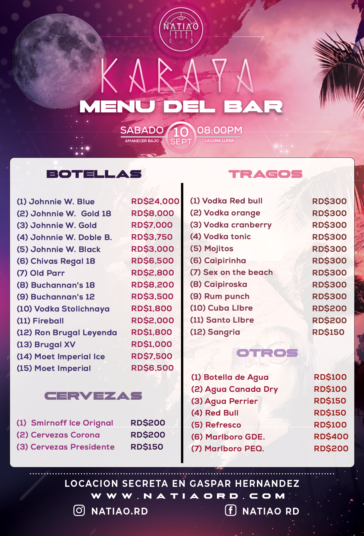
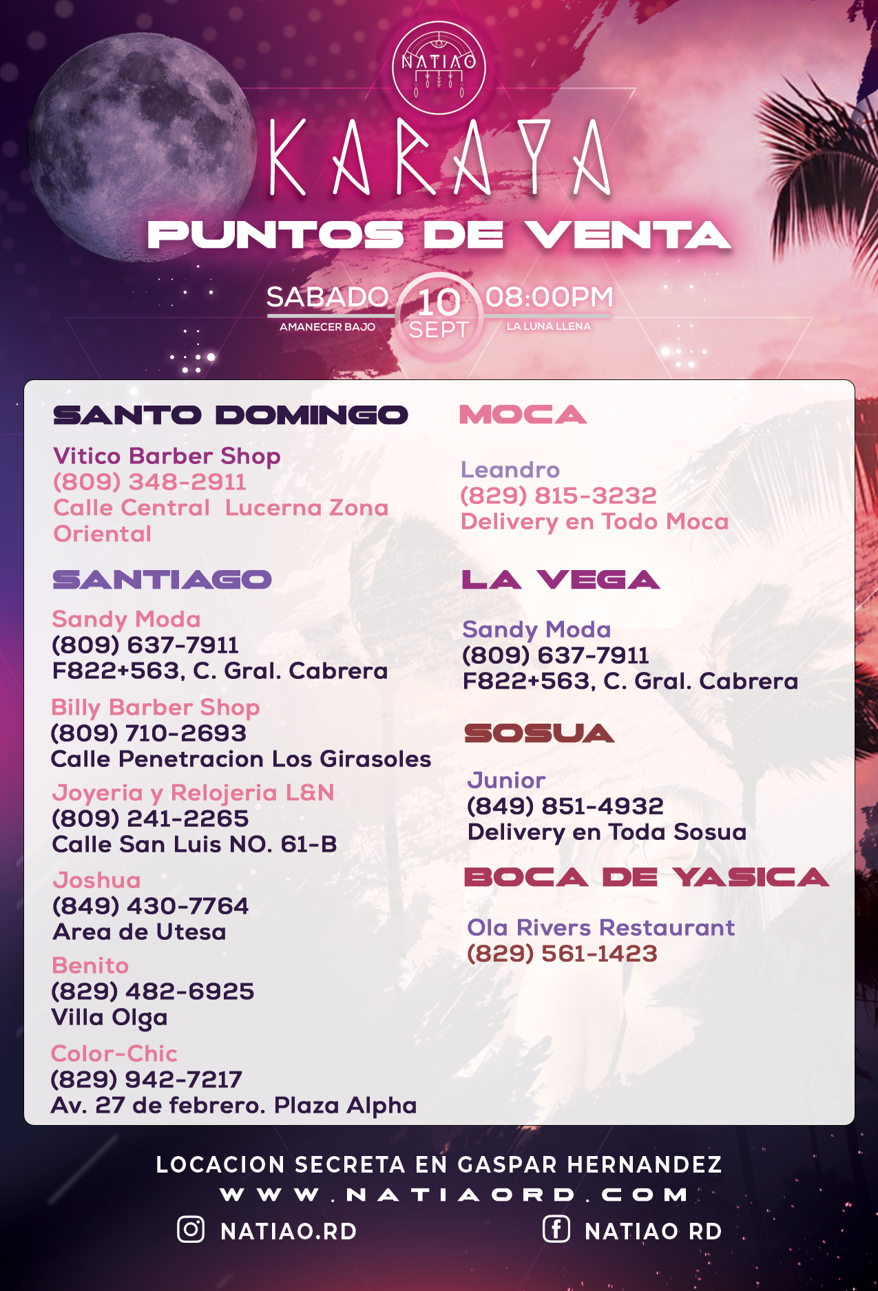
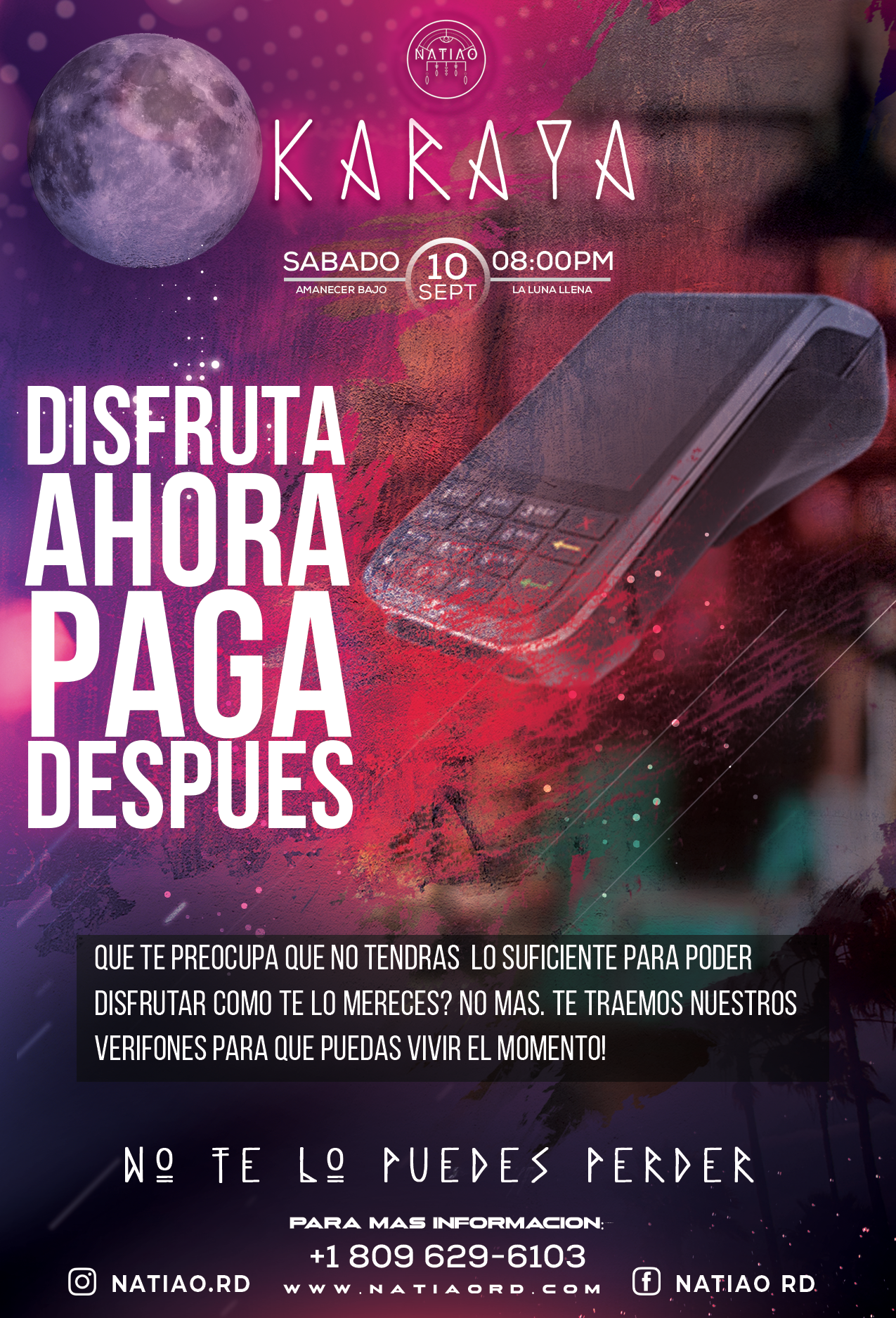
The “Karaya” project was a vibrant and ambitious event aimed at bringing together a diverse audience through a captivating visual experience. Collaborating closely with Natiao, our goal was to develop a cohesive promotional strategy that effectively communicated the essence of the event while appealing to both young adults and professionals.
Through a blend of innovative digital marketing techniques and eye-catching physical materials, we sought to enhance the event’s visibility and generate excitement, ultimately ensuring a significant turnout. The project was marked by a commitment to visual consistency, creativity, and audience engagement, laying the groundwork for a memorable experience that resonated with attendees.
The overall strategy for promoting the “Karaya” event was to create a cohesive visual campaign that aligned the event’s concept with the brand and its target audience. The long-term goal was to increase the event’s visibility, generate high expectations, and ensure massive attendance. We used a mix of digital platforms (social media, paid ads, email marketing) and physical promotions (posters, banners) to reach the audience.
The design centered around creating a vibrant and unique atmosphere that captured the essence of the event. We used a bright color palette and graphic elements that evoked energy and excitement, with a visual focus on what attendees could experience. A consistent visual style was maintained across all materials, from digital invitations to Instagram graphics and event signage.
The biggest challenge was coordinating tight deadlines while maintaining visual consistency across all promotional platforms. Additionally, ensuring that all materials worked equally well in both digital and physical formats without compromising design quality was difficult. We also needed to ensure the style appealed to a diverse audience, ranging from young adults to professionals.
To overcome these challenges, we implemented a modular design approach, where key elements could easily be adapted for different formats and platforms without losing coherence.
To meet the tight deadlines, the team worked in constant collaboration, using tools like Figma to ensure everyone stayed in sync and could make real-time changes. We also conducted preliminary tests on social media to gauge audience response and adjusted the visuals based on feedback.

The visual aesthetic focused on an immersive experience, with a strong emphasis on UI/UX for banners and interactive content on social media. The artistic direction aimed to create visuals that were not only appealing, but also encouraged users to actively engage in the promotion.
The visual composition prioritized readability while incorporating subtle animations and videos to make the ads more dynamic.


Through a wide variety of mobile applications, we’ve developed a unique visual system and strategy that can be applied across the spectrum of available applications.
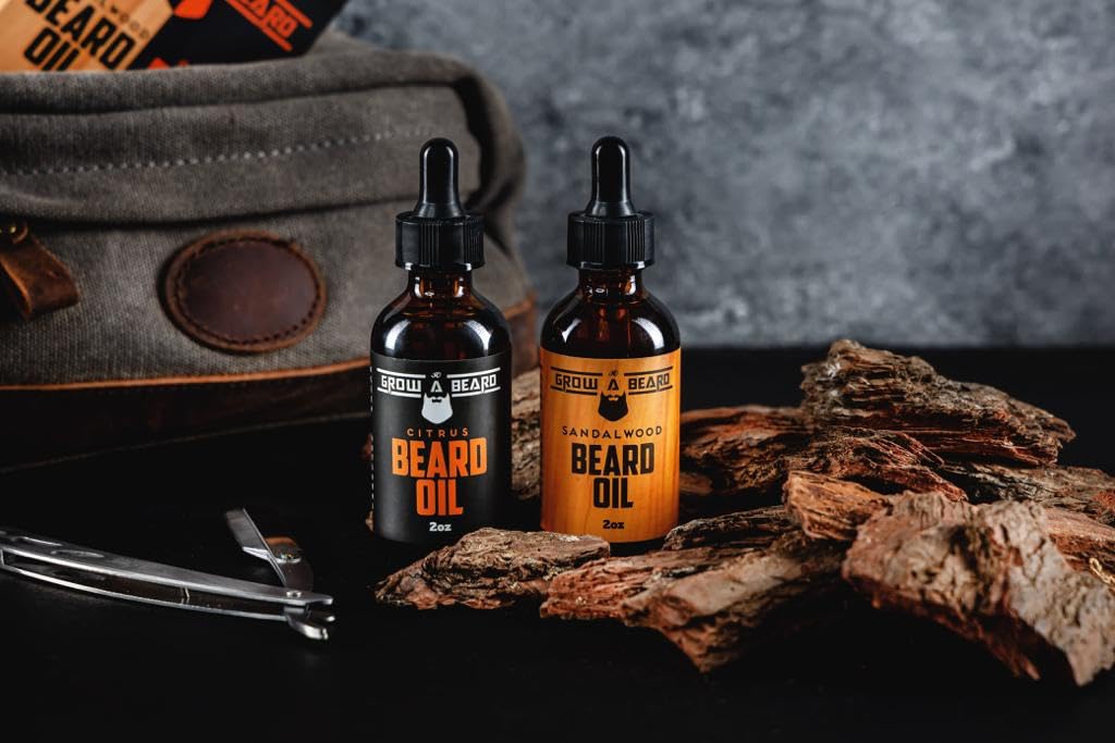
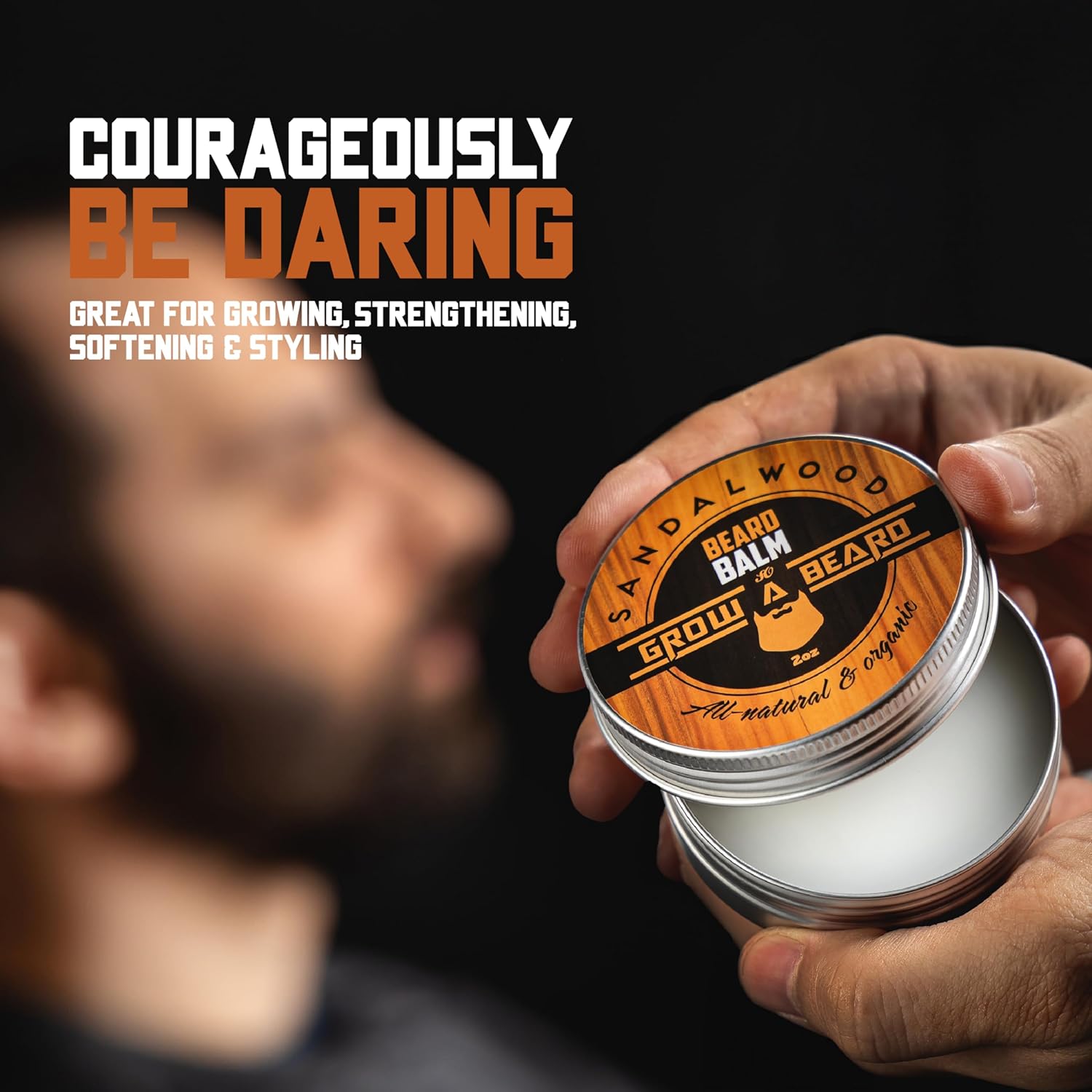
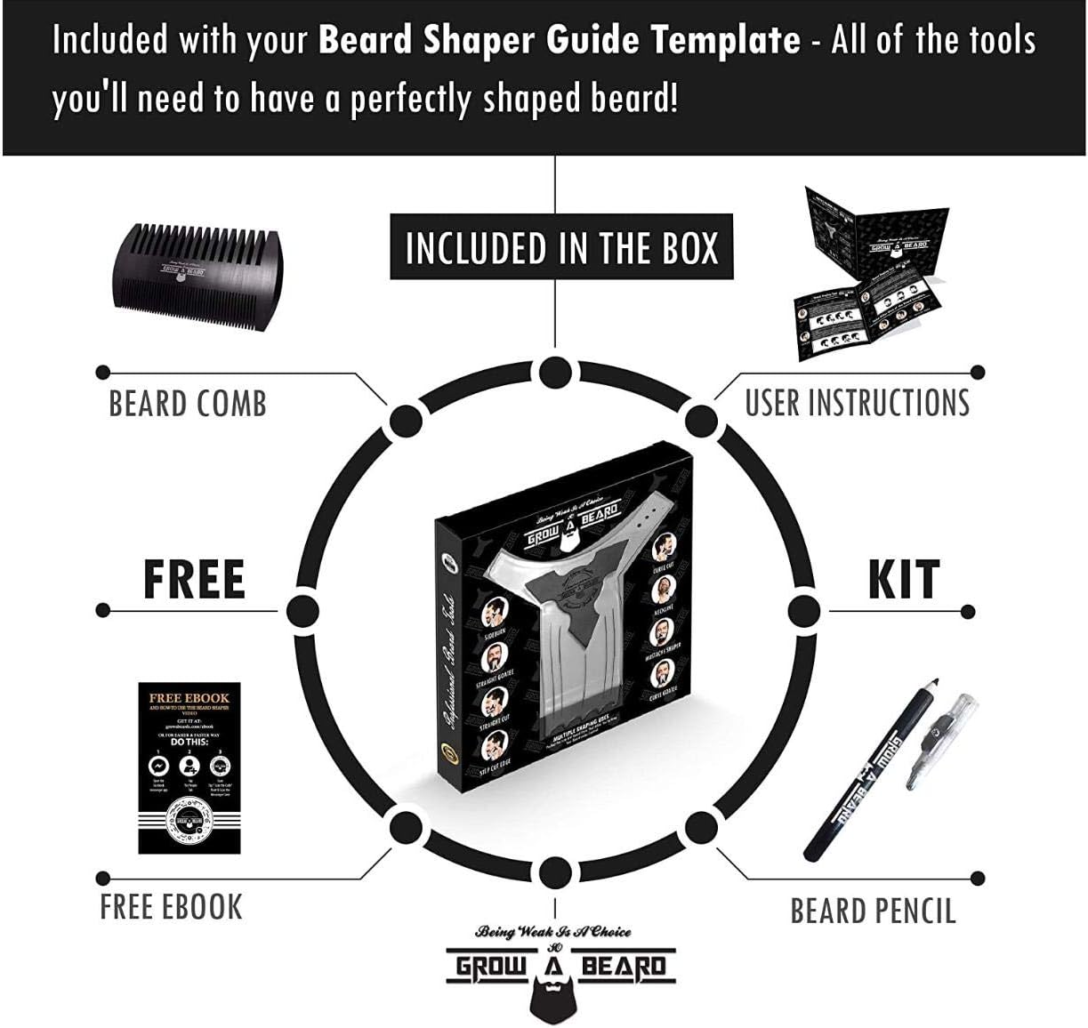
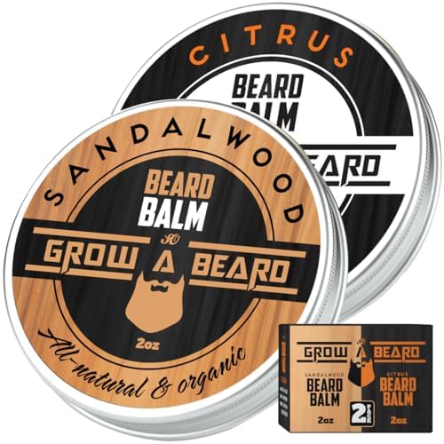
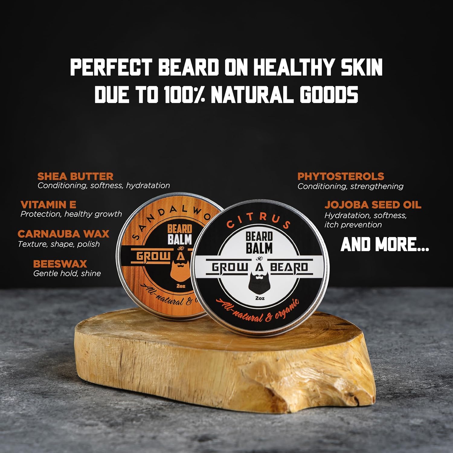
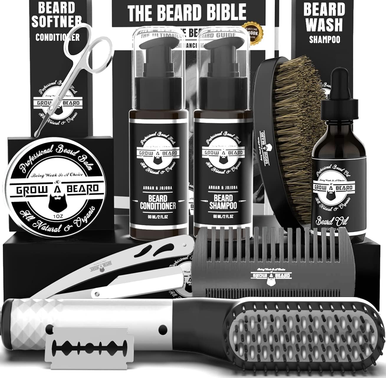
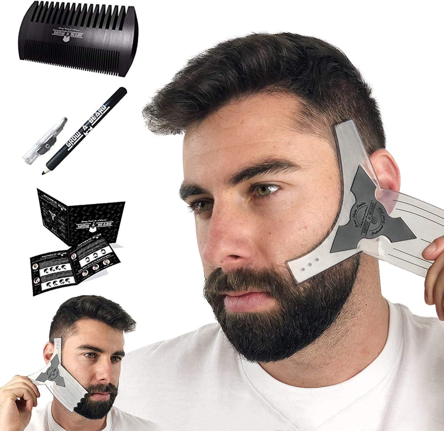
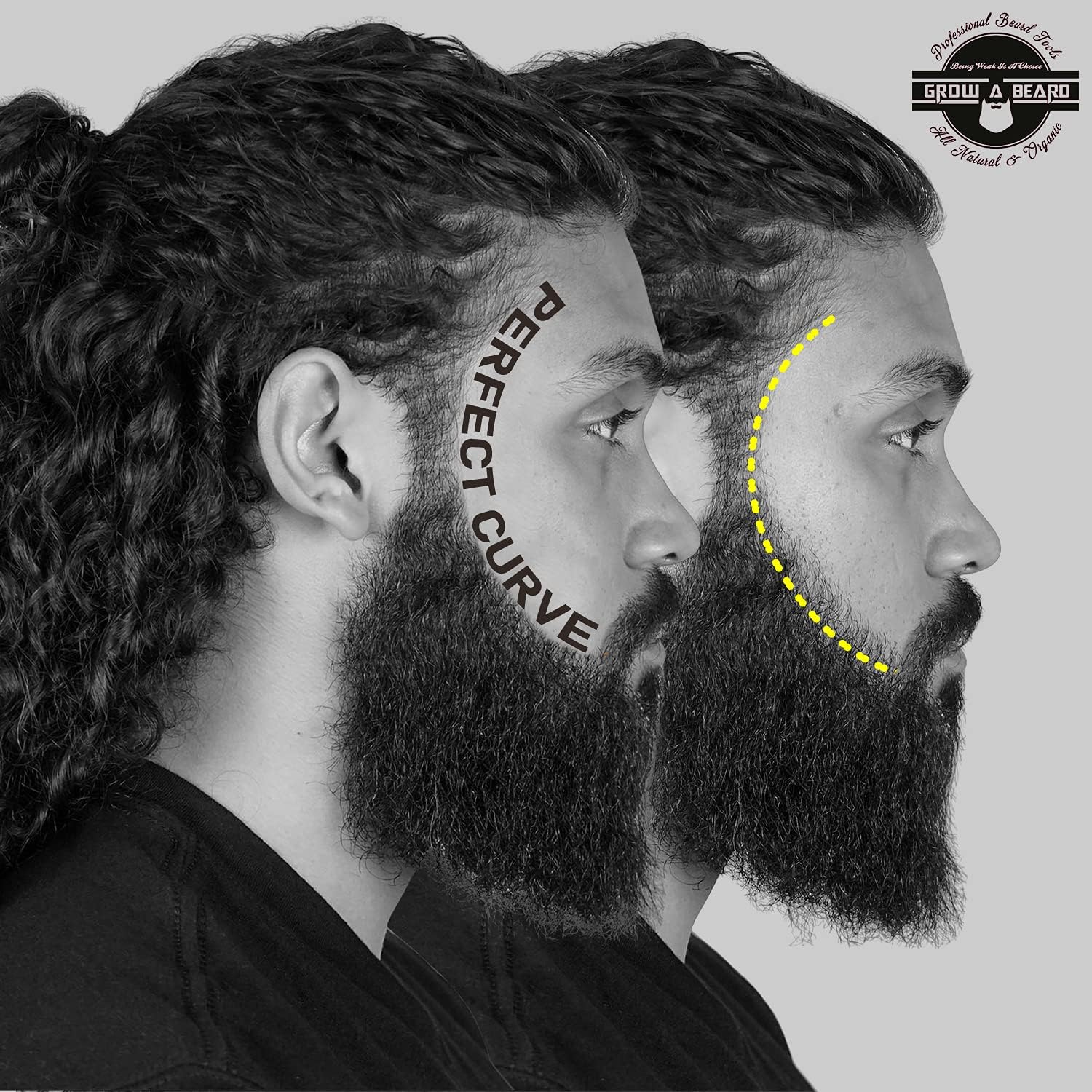
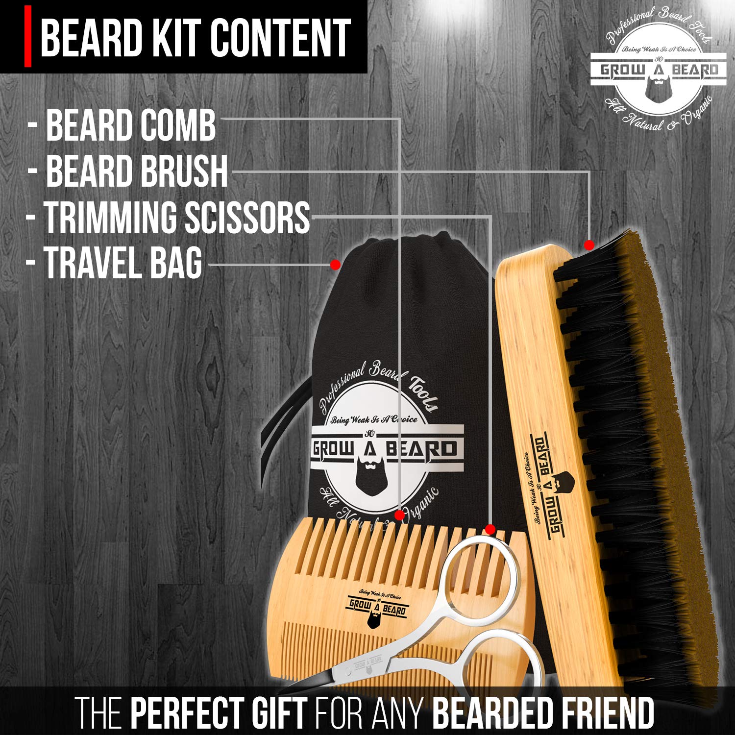
The Grow a Beard strategy was to capitalize on the growing beard care market by offering grooming kits at competitive prices on Amazon. The focus was on providing complete grooming solutions for men, with high-quality kits including combs, brushes, oils, and scissors. The brand optimized organic positioning on Amazon by utilizing specific keywords related to beard care, grooming kits, and men’s personal care products.
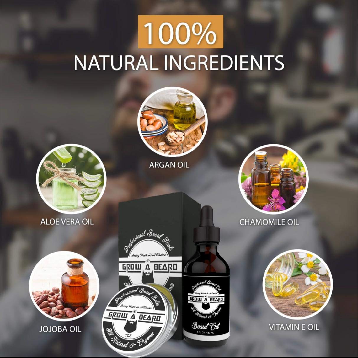
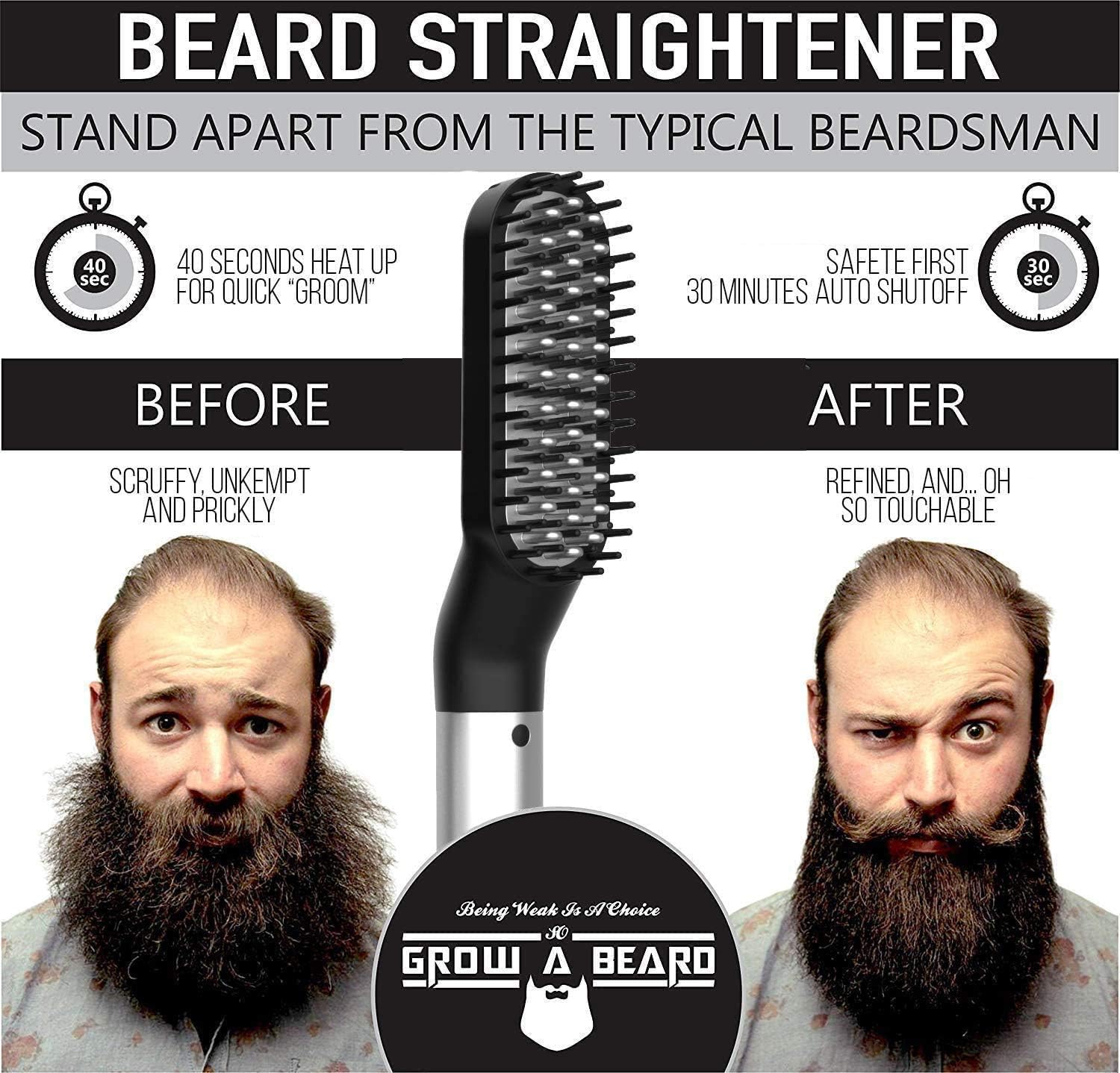
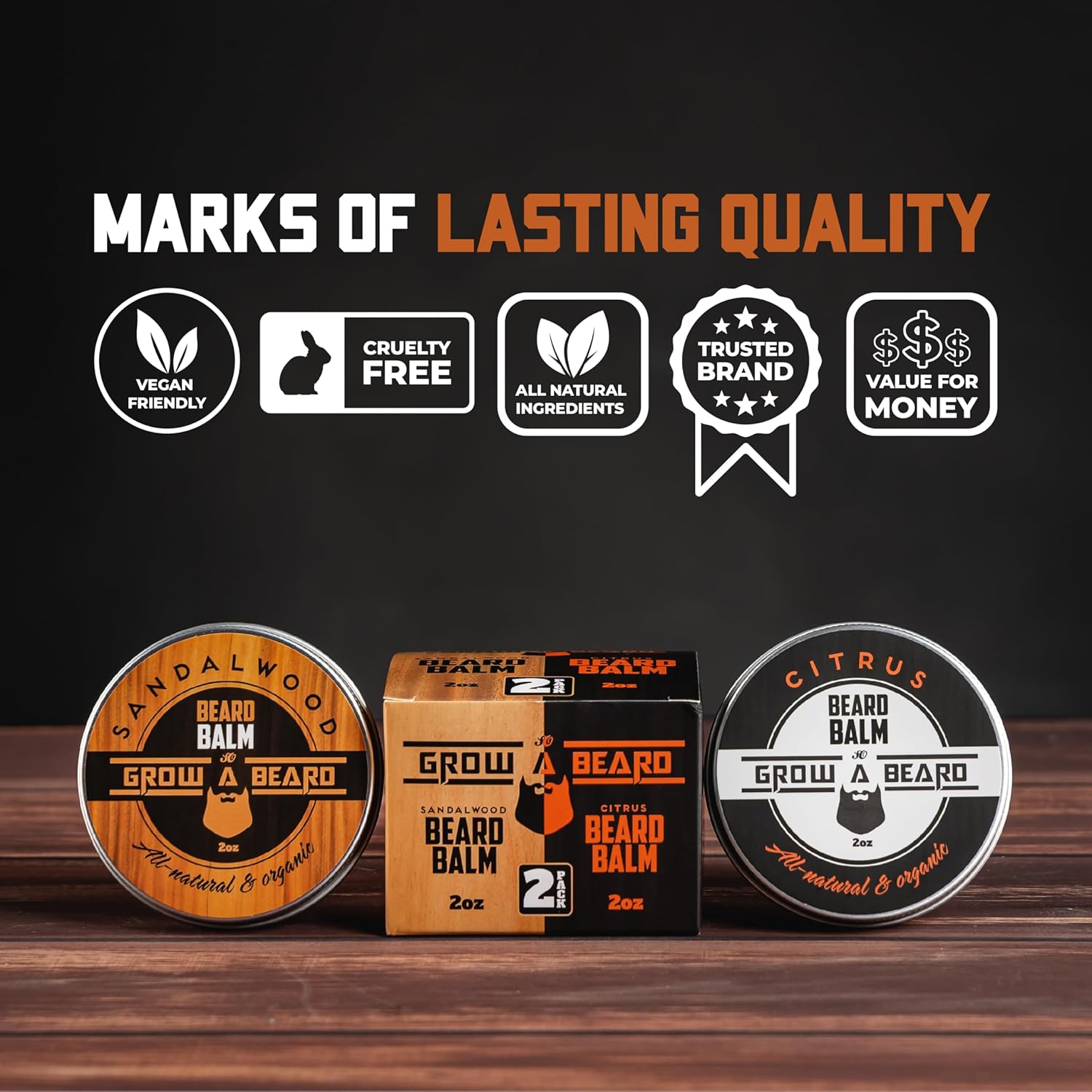
The product design and presentation on Amazon were based on creating a consistent, masculine visual identity using earthy tones and natural elements like wood and boar bristles. This aligned with the rustic, handcrafted image of beard care. Product descriptions and images highlighted the quality of materials, emphasizing the functionality of each item in the kits.
One of the main challenges was standing out in an extremely competitive Amazon market with many similar products. Additionally, maintaining high sales volume required effectively managing reviews and feedback to ensure a strong reputation for product quality and customer service.
Strategies such as Amazon PPC (Pay-Per-Click) were implemented to boost visibility and drive traffic to the product pages. A proactive approach to review management ensured that every customer had a positive experience.
SEO optimization within Amazon included detailed descriptions, precise keywords, and titles emphasizing the key benefits, such as “natural boar bristle” and “complete beard grooming set.” Temporary promotions with significant discounts were launched to generate quick sales.
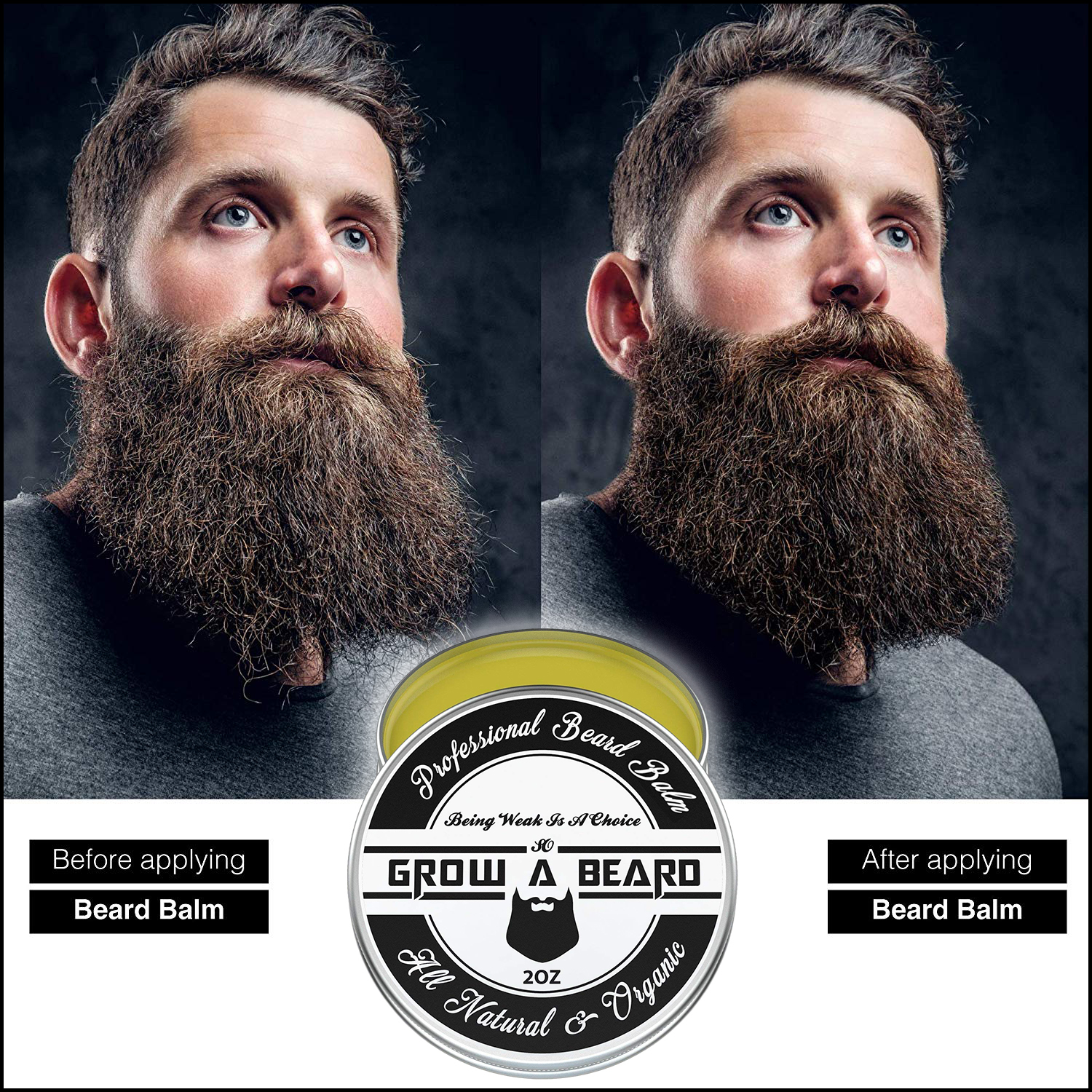

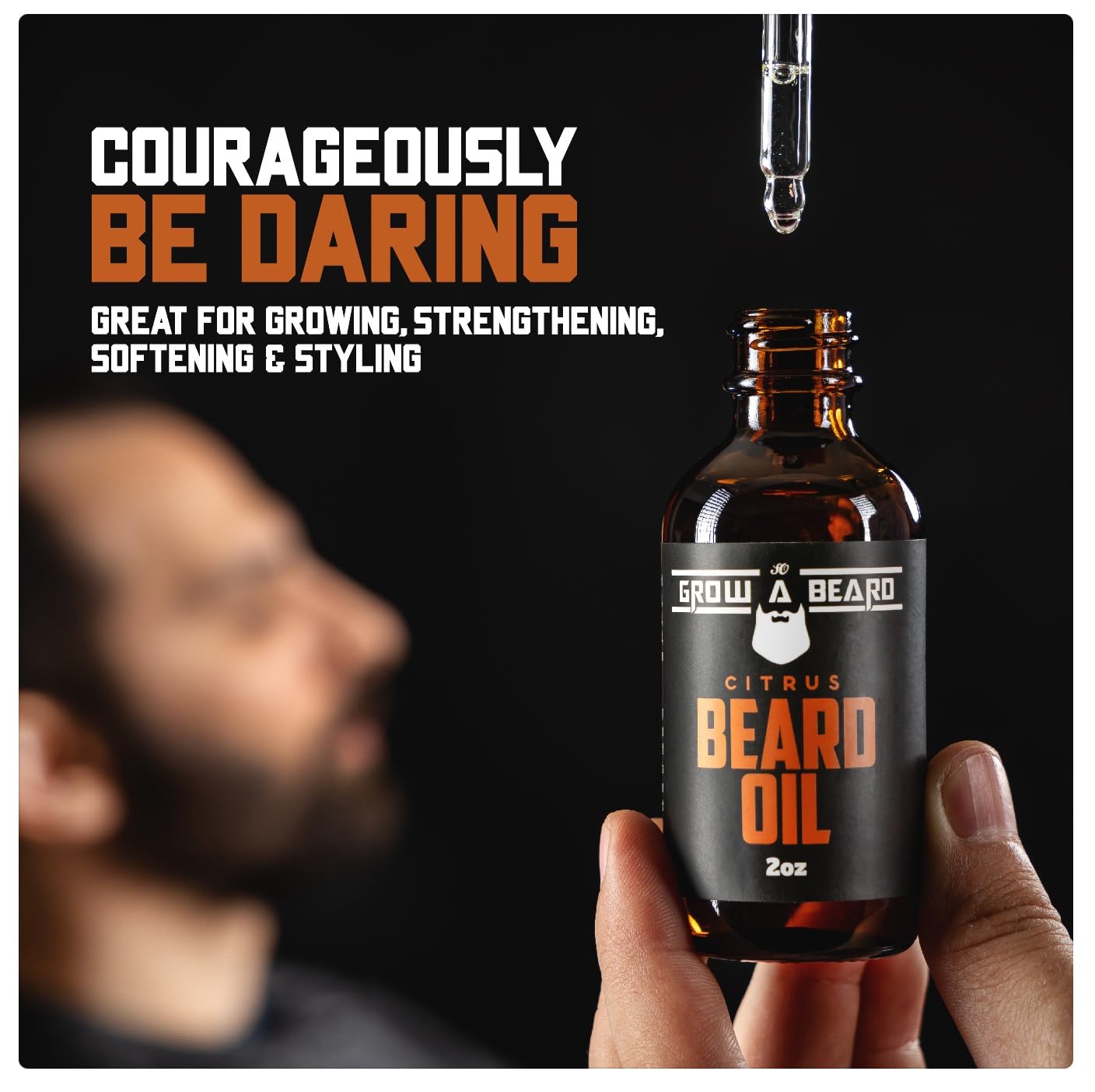
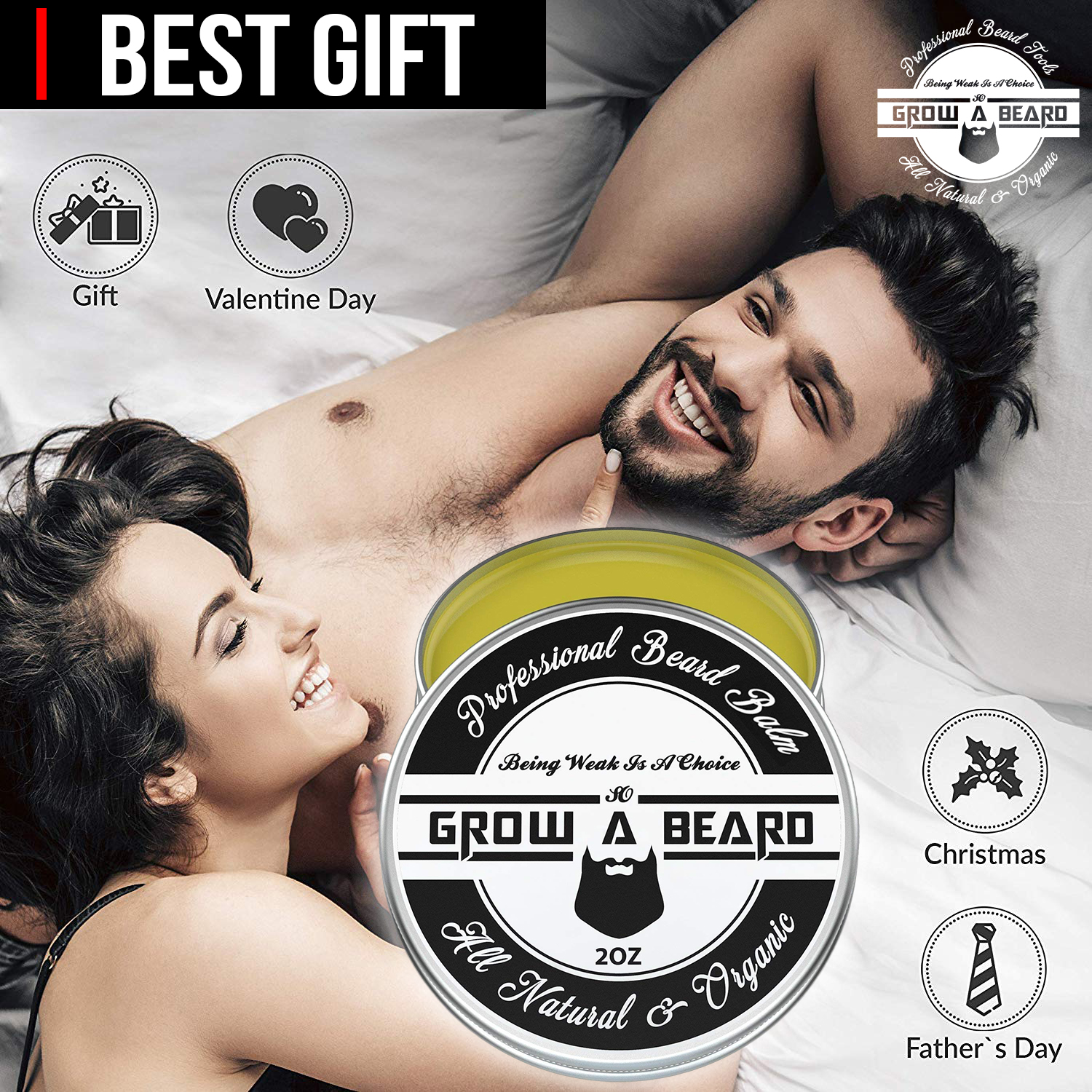
The product listings’ design on Amazon played a crucial role in attracting buyers. High-quality images, angles showing all components of the kit, and photos featuring models demonstrating product use significantly improved the conversion rate. The packaging was highlighted as an attractive gift option, increasing its value as a present for occasions like Christmas.

During my time working with Grow a Beard, I provided a variety of essential services that significantly contributed to the brand’s success on Amazon FBA. Here are the main services I offered:
Through a wide variety of mobile applications, we’ve developed a unique visual system and strategy that can be applied across the spectrum of available applications.
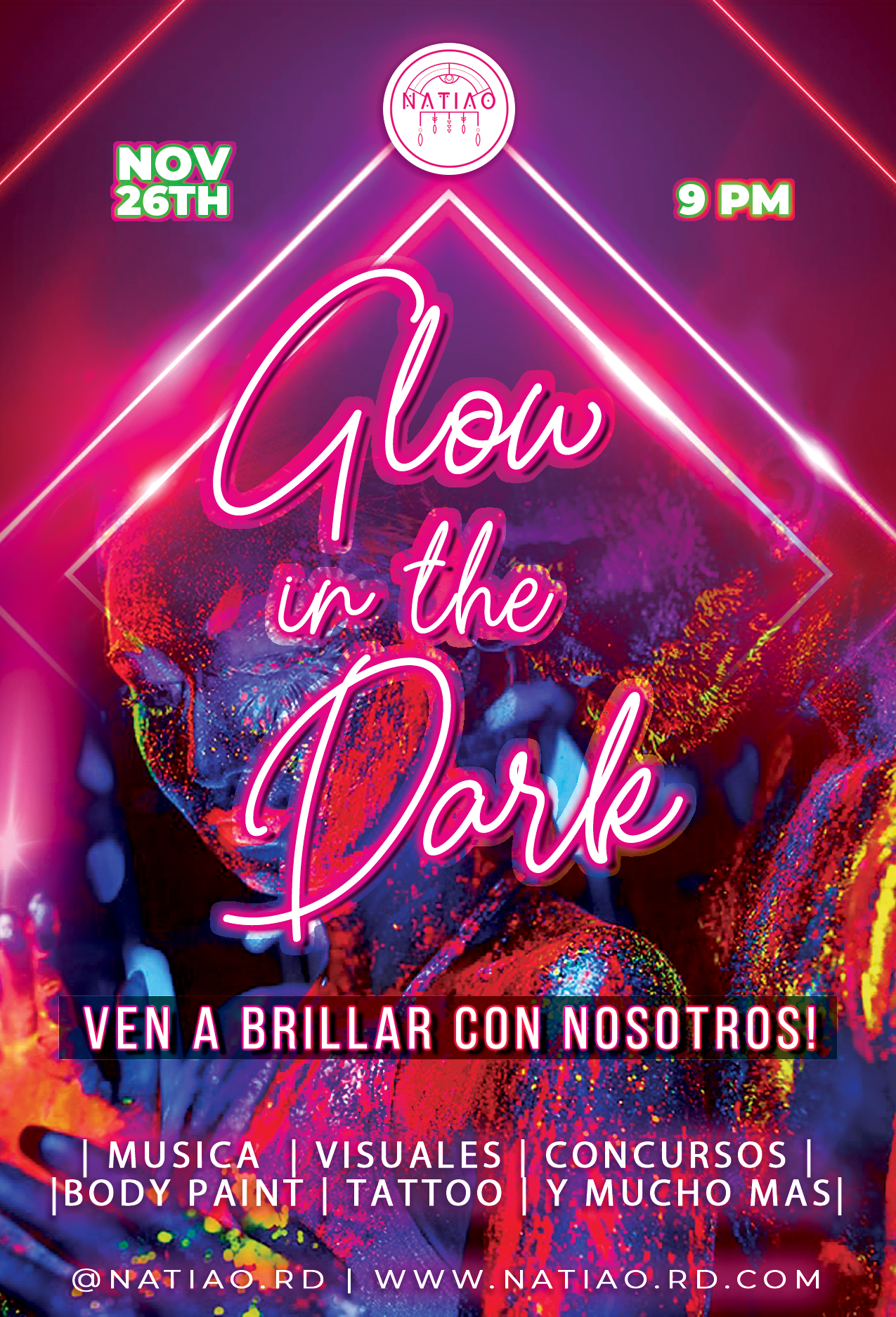
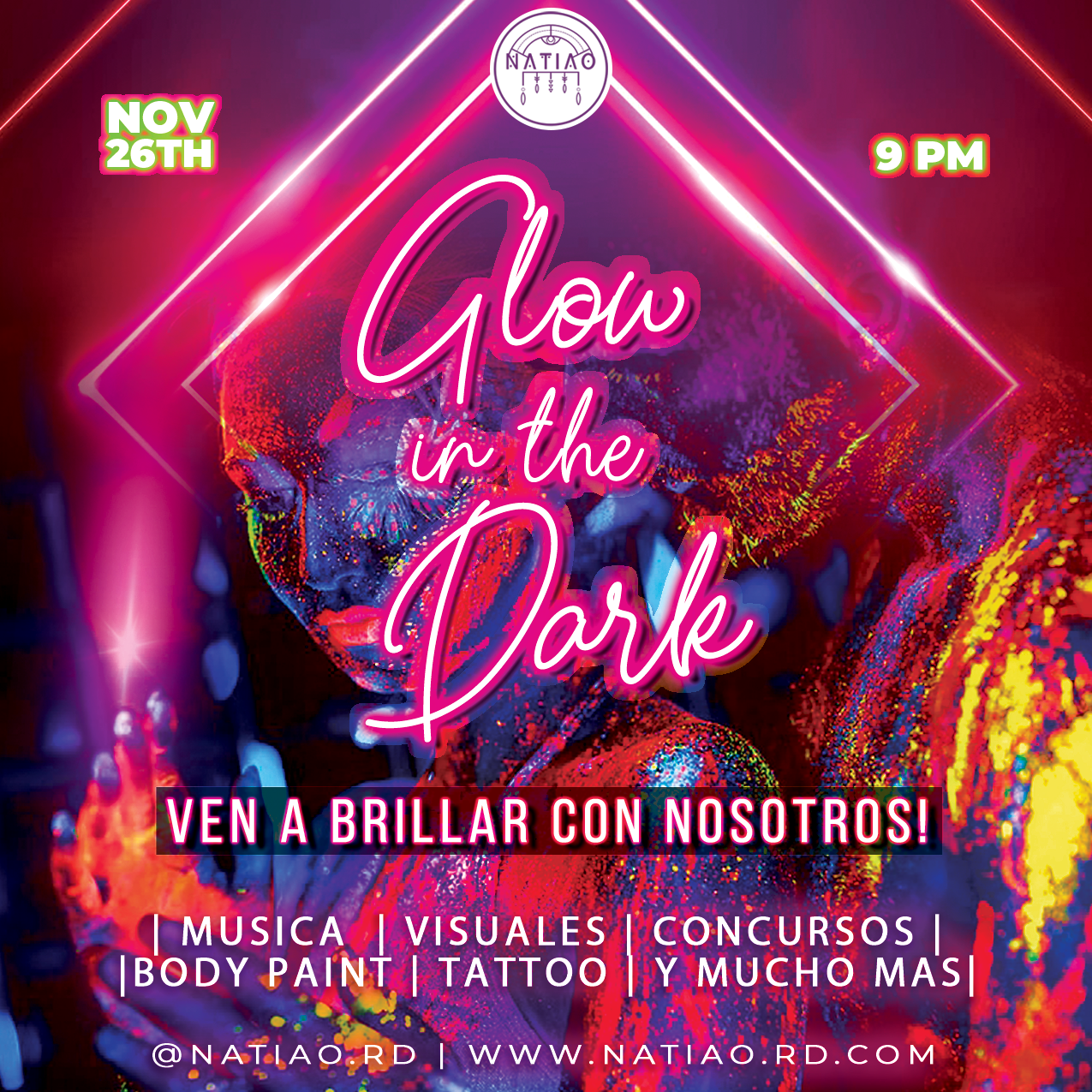
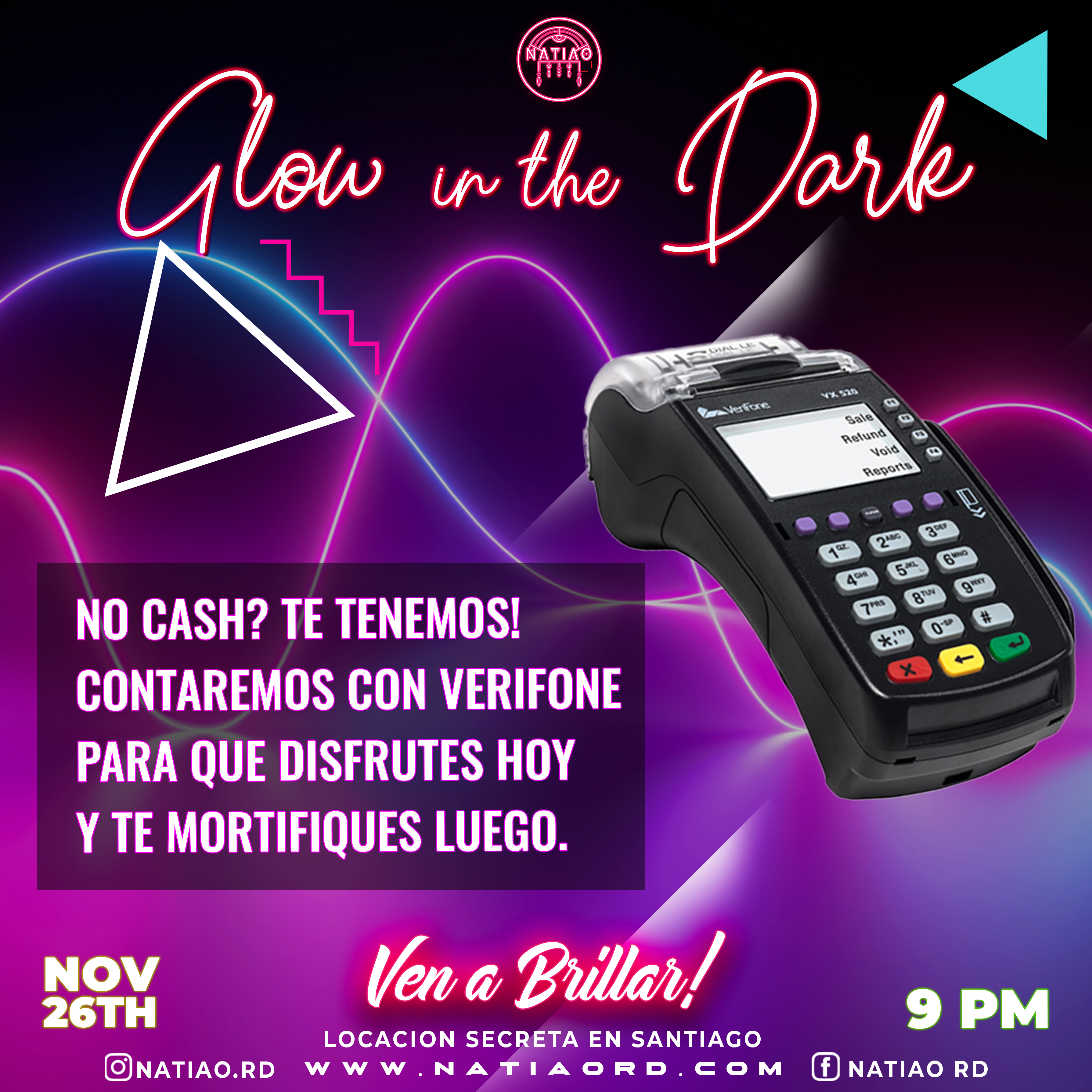
The strategy for Glow in the Dark centered around creating a visual identity that represented a unique and exciting experience aligned with the theme of light and darkness. The goal was to build anticipation, captivate a young, dynamic audience, and fill the event to capacity through promotion on social media, local influencers, and interactive digital media. Additionally, light was a key element used to reinforce the event’s concept.
The design approach focused on creating artwork that stood out across both digital and physical media. We used bright neon colors combined with dark backgrounds to replicate the “Glow in the Dark” effect. The graphics featured futuristic typography and light-based visual elements to emphasize the theme. Digital designs included subtle animations that mimicked flashes and glows.
One of the major challenges was creating an immersive visual experience that resonated across multiple platforms and kept the audience engaged. It was also crucial for the graphics to have the same impact on physical media as in digital ads, without losing the visual glow effect. A short production timeline added further pressure to the project.

One of the major challenges was creating an immersive visual experience that resonated across multiple platforms and kept the audience engaged. It was also crucial for the graphics to have the same impact on physical media as in digital ads, without losing the visual glow effect. A short production timeline added further pressure to the project.
The design was a blend of UI/UX and art direction, focusing equally on aesthetics and functionality. The graphic elements were designed for immediate impact and to spark curiosity. In digital settings, the artwork was accompanied by animations that simulated glowing lights in the dark, while static elements reflected the style through the contrast of light and shadow. We paid special attention to audience interaction by creating custom stickers and filters for social media.
Through a wide variety of mobile applications, we’ve developed a unique visual system and strategy that can be applied across the spectrum of available applications.
When it comes to my design skills, I have a strong command of various visual styles and techniques. My creations are highly adaptable to the needs of different brands, whether they focus on the natural and organic or the modern and technological.
For this logo, I wanted to convey professionalism and trust through a modern and clean style. “SHEBE” is written in vibrant blue and in uppercase to instantly capture attention, while “Agency” is set in a lighter, more elegant typeface to create an interesting contrast that reinforces the agency’s creativity and flexibility. This visual combination is ideal for brands or agencies looking to project a fresh, modern, and approachable image, without losing the professional touch.
The design I created for “NATIAO” is inspired by indigenous or traditional cultural elements, showcasing a clear focus on art and symbolism.
The circular structure and geometric details add a touch of mystery and depth, while the choice of black and white gives it a timeless and classic feel. With this logo, I wanted to honor the brand’s cultural roots, promoting a connection with the past and its traditions.
I enjoy working with customized typography and strategically playing with colors to create a strong and cohesive visual identity. Additionally, my logos are characterized by their simplicity, ensuring they are versatile and easy to apply across any medium, whether digital or print.

For this logo, I wanted to convey professionalism and trust through a modern and clean style. “SHEBE” is written in vibrant blue and in uppercase to instantly capture attention, while “Agency” is set in a lighter, more elegant typeface to create an interesting contrast that reinforces the agency’s creativity and flexibility. This visual combination is ideal for brands or agencies looking to project a fresh, modern, and approachable image, without losing the professional touch.
This logo conveys calm and sophistication at first glance. The image of a man in a relaxed posture, along with the soft golden curve, evokes tranquility and luxury. The choice of elegant and modern black typography reflects exclusivity, while the slogan in gold adds a premium touch. This design is clearly aimed at a male clientele, seeking to project a high-quality spa experience focused on wellness and personal care.
This logo reflects my focus on the organic and natural, perfect for a brand centered on sustainable or agricultural products. In the design, I represent a macadamia nut in a minimalist style with an orange color, highlighting the brand’s core product. By choosing fonts that blend modern and handcrafted styles, I use cursive and handwritten fonts that evoke a sense of closeness. The green and black colors add a touch of freshness and elegance. Through this logo, I aim to communicate a connection between nature, sustainability, and the brand’s customers.
The logo for this brand is bold and attention-grabbing, designed to immediately catch the eye. The use of a bright pink tone with graphic elements, such as a devil’s tail wrapped around the letter “O”, adds a playful and rebellious feel. This design fits a daring, modern brand, possibly linked to entertainment or a youthful community. The combination of strong black typography with the bold, feminine touch of pink creates a visual contrast that highlights the brand’s unique essence.

Through a wide variety of mobile applications, we’ve developed a unique visual system and strategy that can be applied across the spectrum of available applications.
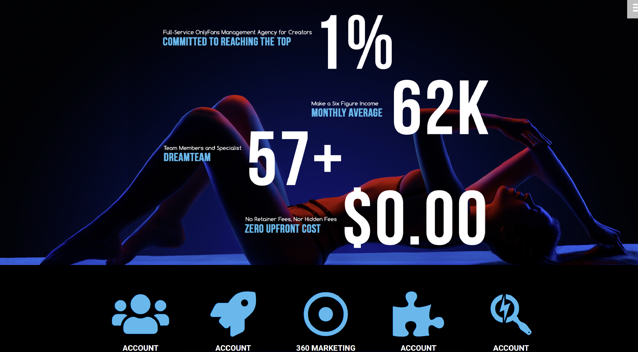
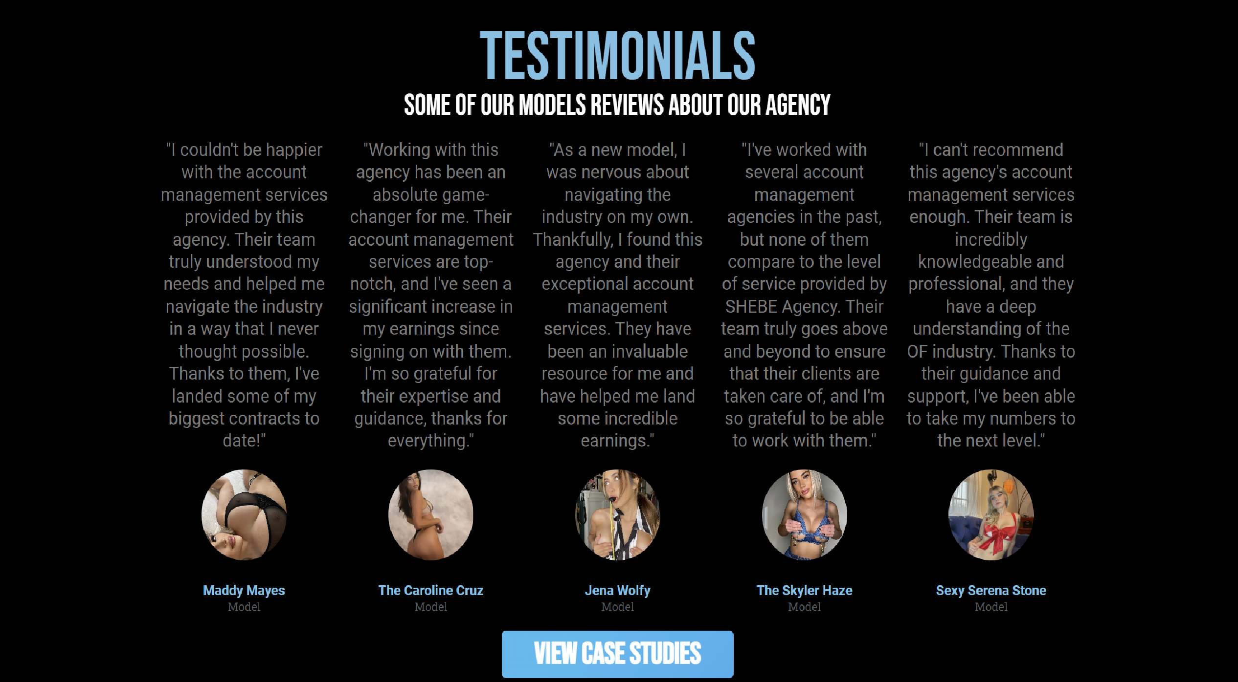
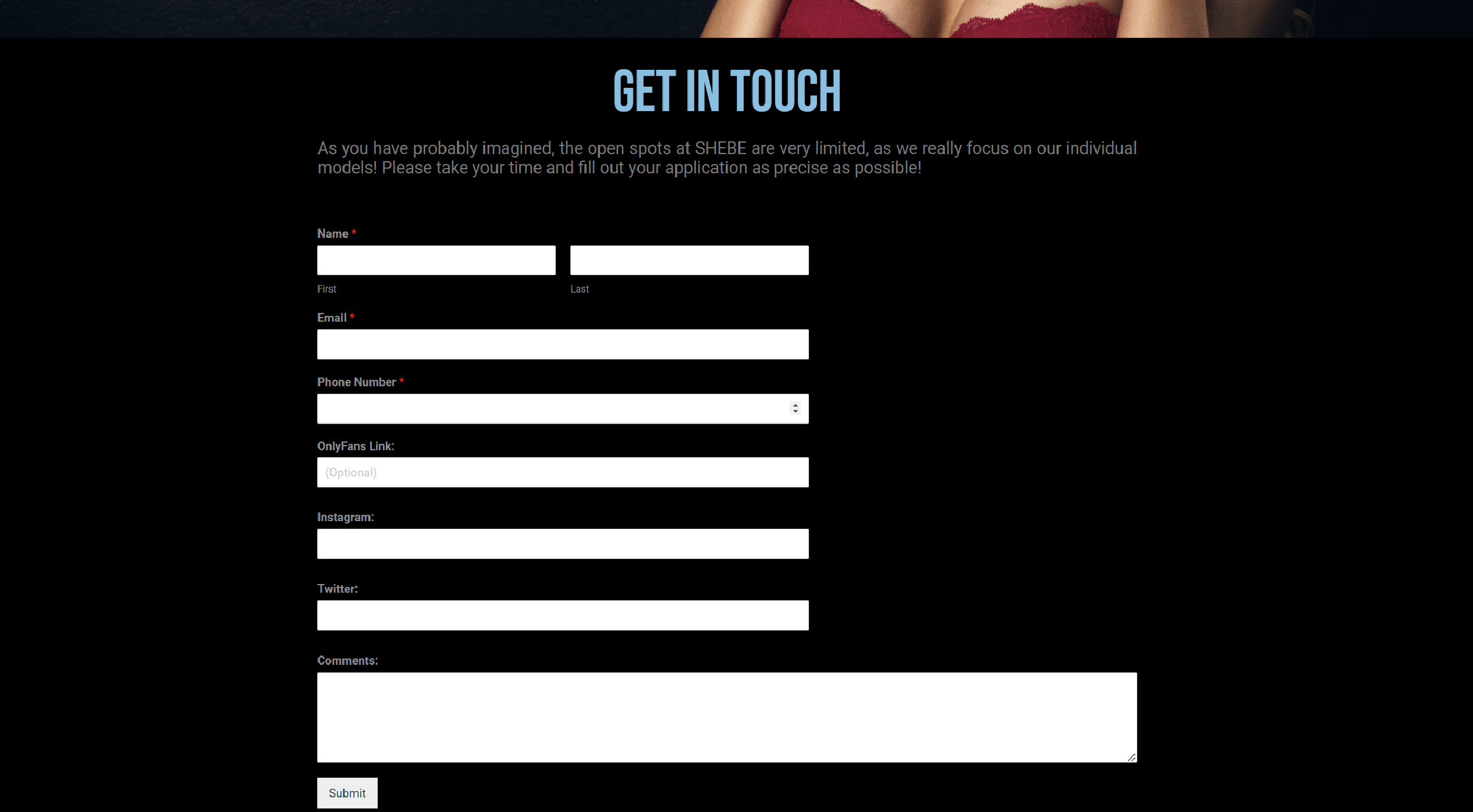
Shebe Agency is a leading management agency for OnlyFans models, specializing in significantly increasing the earnings of its content creators. As the UI/UX Designer and Web Developer, my primary objective was to design and develop a platform that communicated the agency’s unique value proposition while optimizing the user experience for both models and the management team.
Design Approach:
The approach focused on creating an intuitive user experience aligned with the agency’s core values: accelerated growth, financial stability, and income maximization. Through a visually appealing and highly functional interface, the goal was to convey trust and professionalism. The UI/UX design prioritized clear navigation, allowing models and visitors to easily access key information.
Project Challenge:
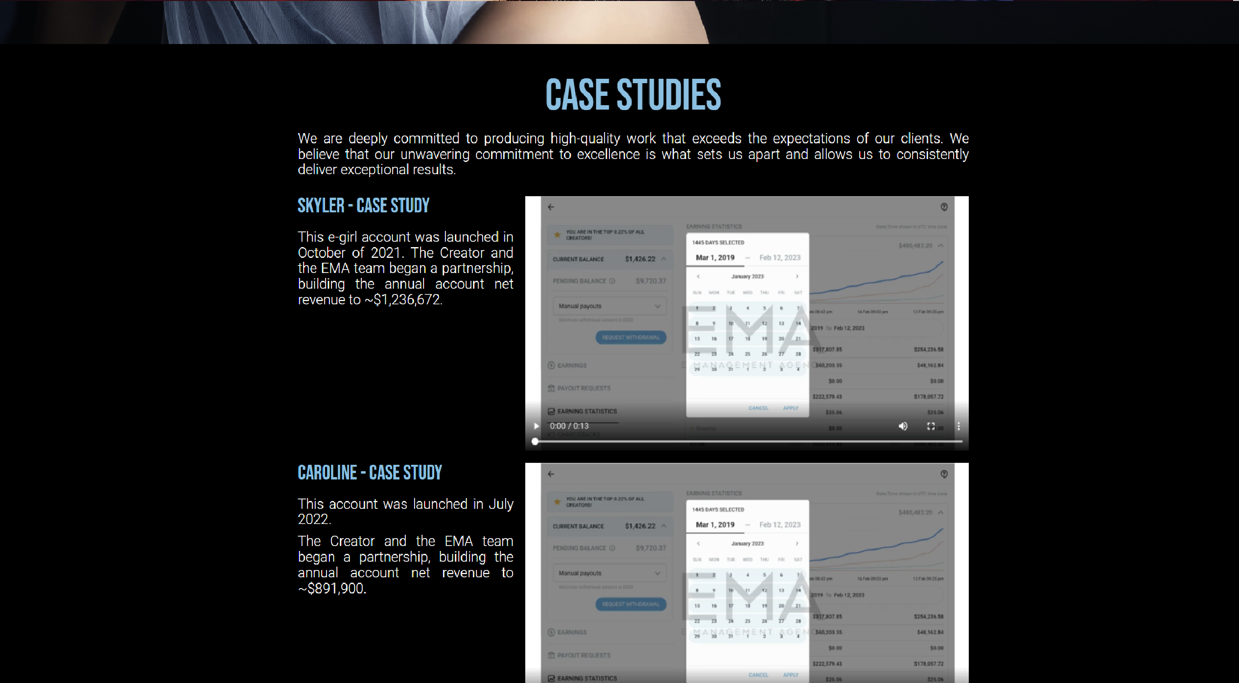
The main challenge was developing a platform that could accommodate multiple user profiles, ranging from models with little to no social media presence to well-established creators. The website needed to reflect the agency’s ability to grow accounts from scratch to surpass $100,000 in monthly revenue within 4-5 months.

Solution:
I implemented a responsive design that catered to the needs of different users, ensuring a seamless experience across mobile and desktop devices. The site features a clear and accessible navigation structure, integrating services such as account management, growth strategies, and account audits. Additionally, I optimized the website for fast load times and enhanced search engine visibility, which contributed to increased talent acquisition.
Design (UI/UX Design, Art Direction):
I implemented a responsive design that catered to the needs of different users, ensuring a seamless experience across mobile and desktop devices. The site features a clear and accessible navigation structure, integrating services such as account management, growth strategies, and account audits. Additionally, I optimized the website for fast load times and enhanced search engine visibility, which contributed to increased talent acquisition.
Results:
The resulting platform not only improved the agency’s overall brand perception but also enhanced the conversion of prospects into clients. With an optimized navigation structure and a user-centric design, the agency experienced a significant increase in model applications and improved account management efficiency.
Through a wide variety of mobile applications, we’ve developed a unique visual system and strategy that can be applied across the spectrum of available applications.
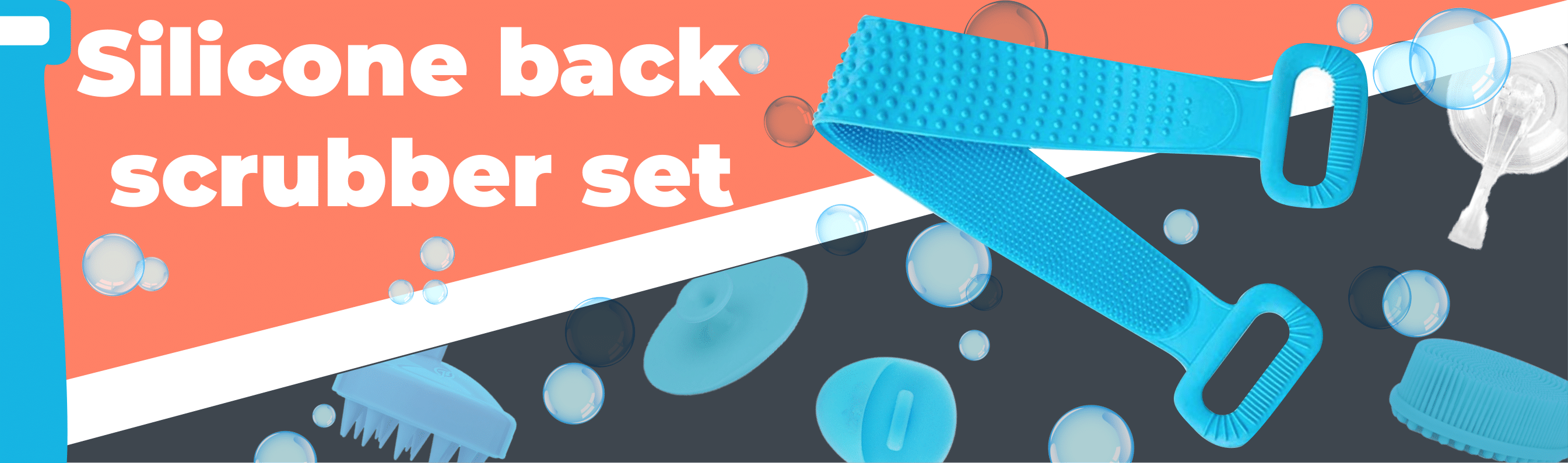
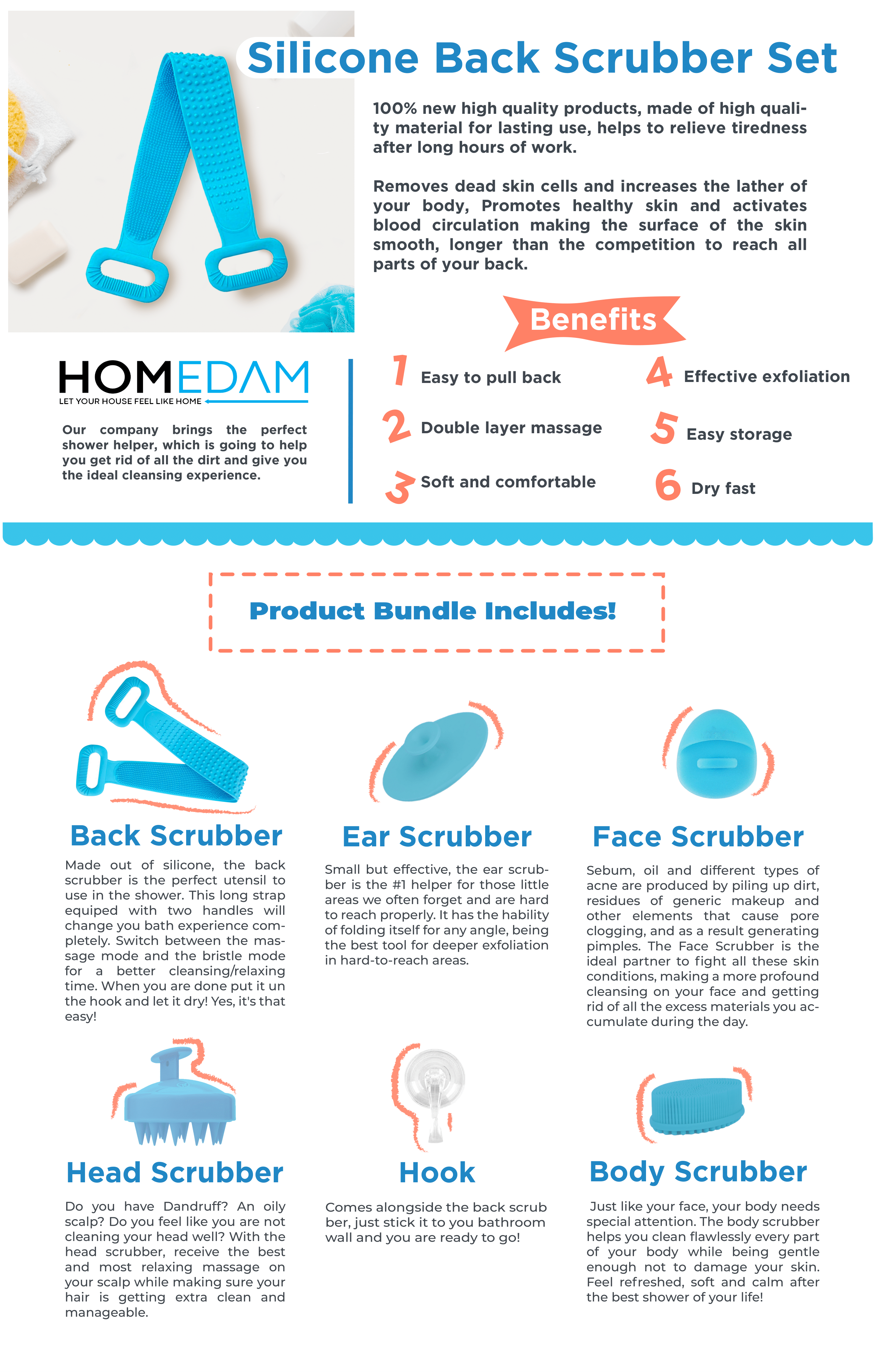
The Homedam strategy focused on meeting the high demand for practical, affordable home goods that enhance daily life. The brand leveraged competitive pricing, quality assurance, and detailed product listings to stand out. The use of Amazon SEO optimization, targeted keywords, and the strategic use of Amazon PPC campaigns ensured consistent visibility and traffic, helping the products rank on the first pages of results for categories such as home essentials and personal care.
The product design and presentation for Homedam products revolved around functionality and aesthetic simplicity. By using clean, minimalistic designs in product images, the brand conveyed the practicality and value of the items. The listings were tailored to the modern consumer, focusing on high-quality materials, user-friendly features, and an appealing lifestyle-driven look. The visual identity was aligned with home decor and wellness trends, resonating with a wide audience.

The main challenge with Homedam was breaking into a highly saturated market for household goods on Amazon, where hundreds of similar products already existed. Additionally,
it was important to maintain positive reviews and manage customer feedback effectively to retain the Amazon Choice badge, which required continuous monitoring and product updates.
Homedam applied several strategies to tackle these challenges, including optimizing the listings with keyword-rich descriptions, high-quality images, and engaging titles.
The use of Amazon Choice badges for products gave them extra credibility, boosting sales further. Additionally, engaging with customers through post-purchase follow-ups and encouraging reviews helped maintain a positive brand image. Promotions, bundled deals, and limited-time discounts also contributed to boosting sales.
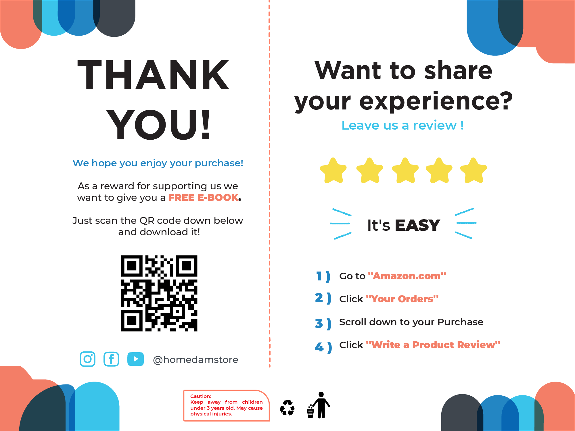
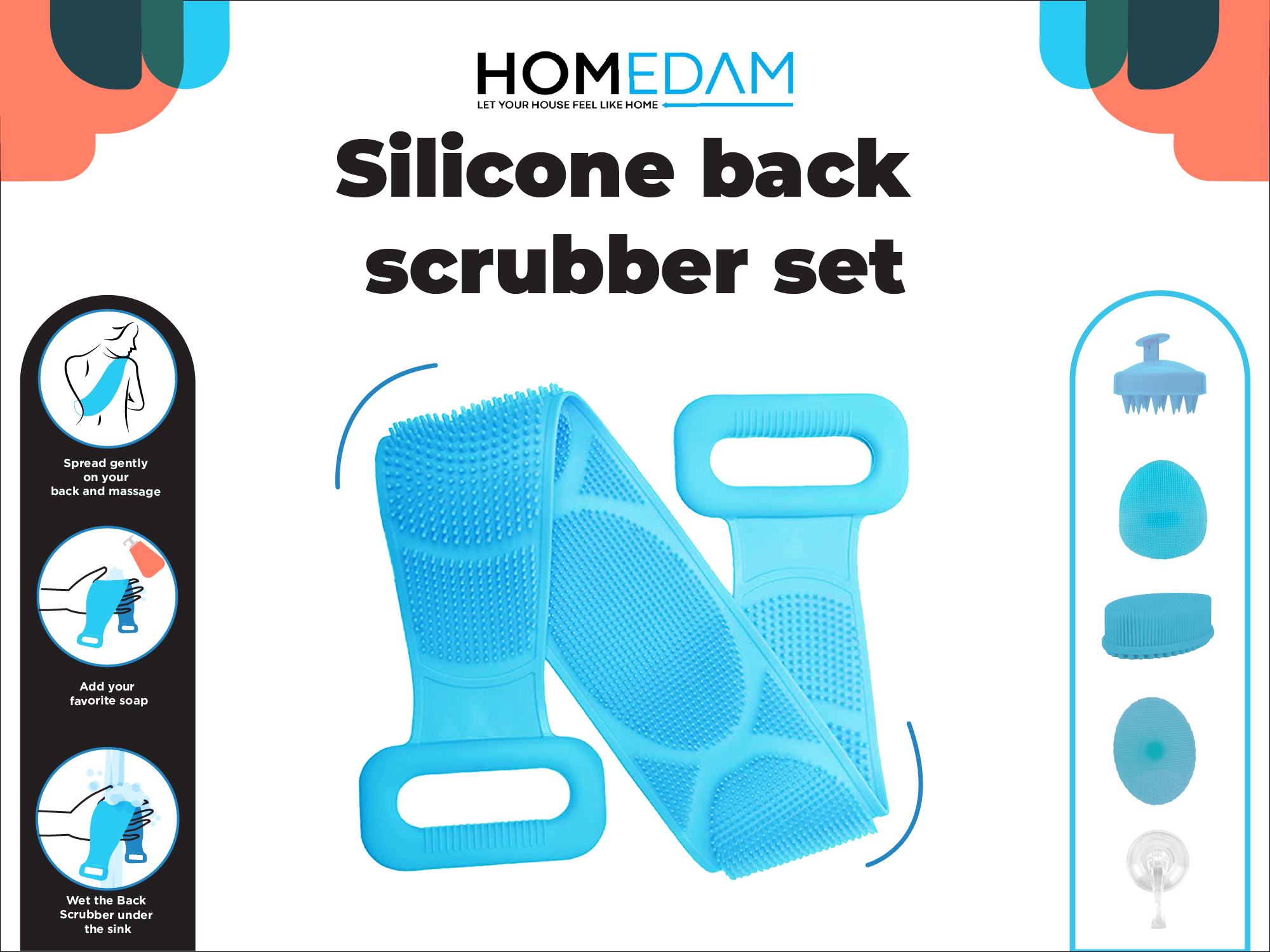
The design of Homedam listings was crafted to showcase products clearly, with a strong focus on clean visuals that highlighted the product’s features and benefits.
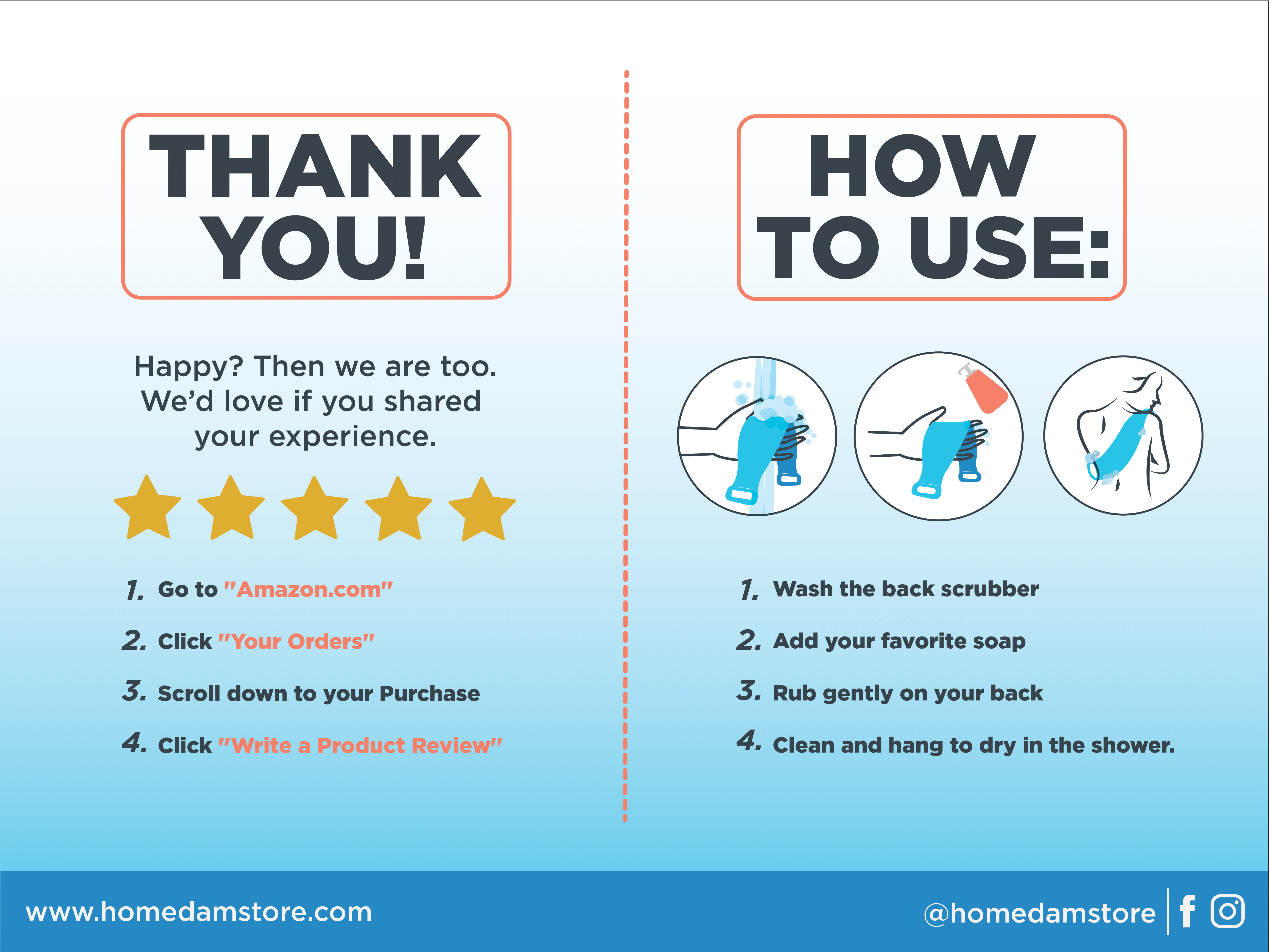
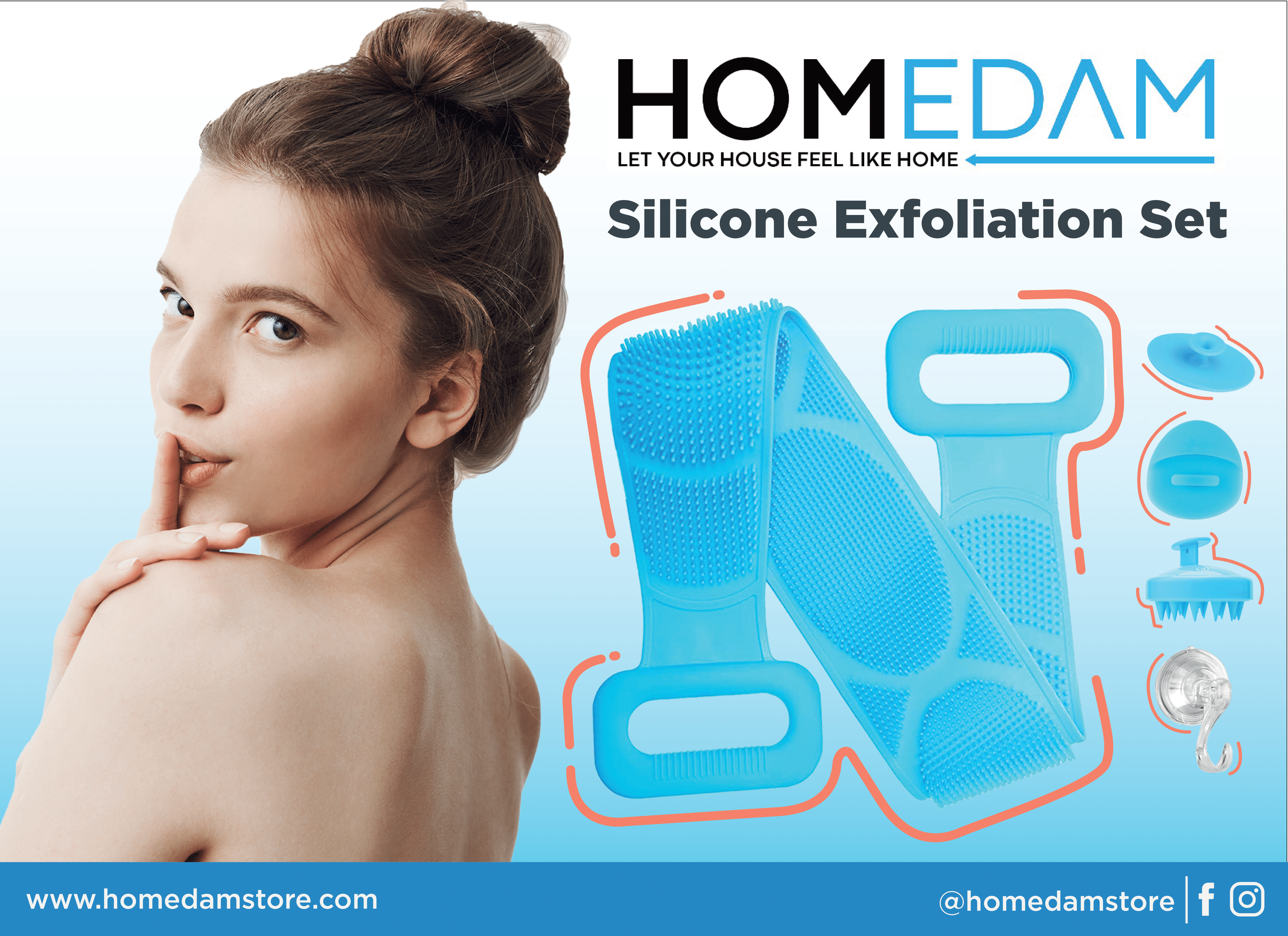
The branding was modern and functional, appealing to consumers looking for efficiency and quality in home products. Packaging was also designed to communicate a sense of value and reliability, further encouraging customer loyalty.
During my time working with Homedam, I offered a range of specialized services that contributed to the brand’s performance and growth on Amazon FBA. Here are the key services I provided:
End-to-End Amazon Product Management: I was responsible for the full product management process, from setting up optimized product listings to handling inventory control, ensuring that products were consistently available to meet demand.
Product Launch Campaigns: I spearheaded the product launch process, leveraging Amazon SEO techniques, keyword optimization, and early review strategies. My approach focused on generating initial sales momentum to boost product ranking on Amazon search results.
Amazon SEO Optimization: Through extensive keyword research and listing optimization, I helped improve product visibility on Amazon, which increased both traffic and conversions. This involved refining product titles, bullet points, and descriptions to target relevant customer searches.
Sales and Data Analysis: I regularly monitored sales data and campaign performance, using these insights to adjust marketing strategies in real-time. By preparing detailed weekly and monthly sales reports, I provided actionable insights to continuously enhance growth and ROI.
Amazon PPC Campaign Management: I managed and optimized Amazon Pay-Per-Click (PPC) advertising campaigns, focusing on maximizing sales at the lowest possible cost. Through careful keyword management and bid adjustments, I ensured the campaigns consistently delivered strong results.
Branding and Positioning: I assisted in the development of Homedam’s brand identity, creating compelling visuals and content that helped differentiate the brand from its competitors. This included maintaining a cohesive brand image that built customer loyalty and trust.
Customer Review Management: I established strategies for encouraging customer feedback and reviews, focusing on increasing both the quantity and quality of reviews. Engaging with customers directly helped in building a solid reputation on the platform.
Through a wide variety of mobile applications, we’ve developed a unique visual system and strategy that can be applied across the spectrum of available applications.
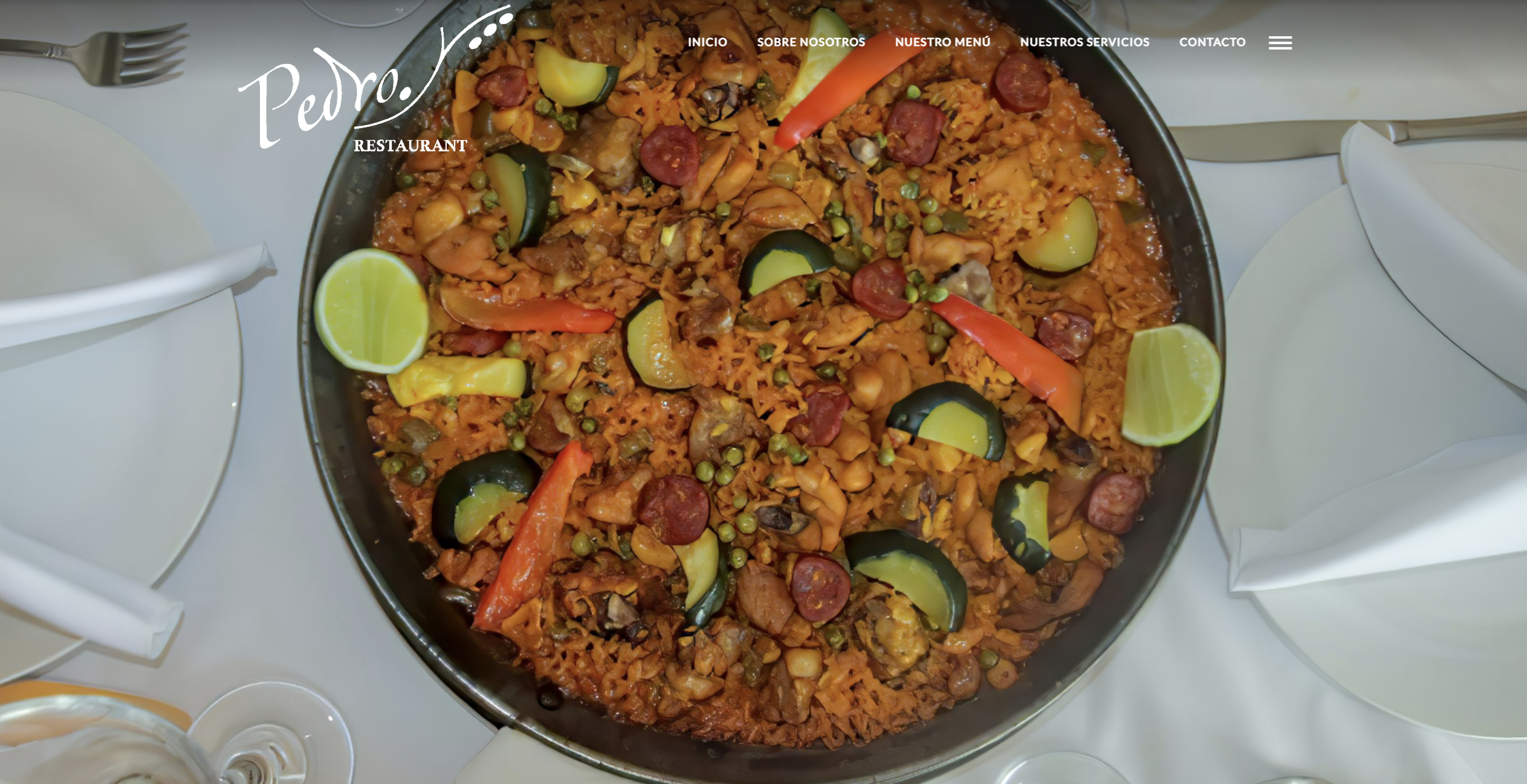
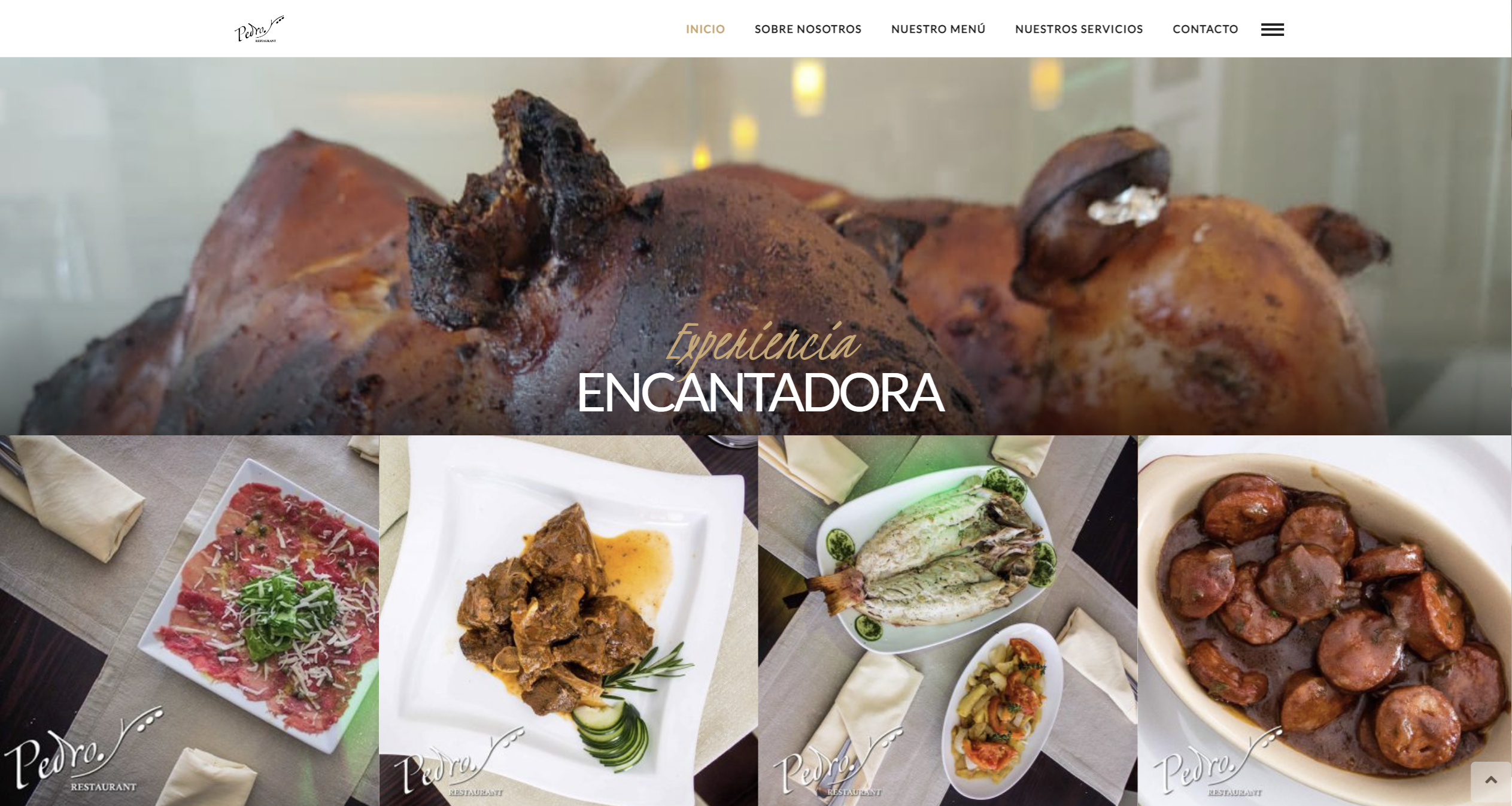
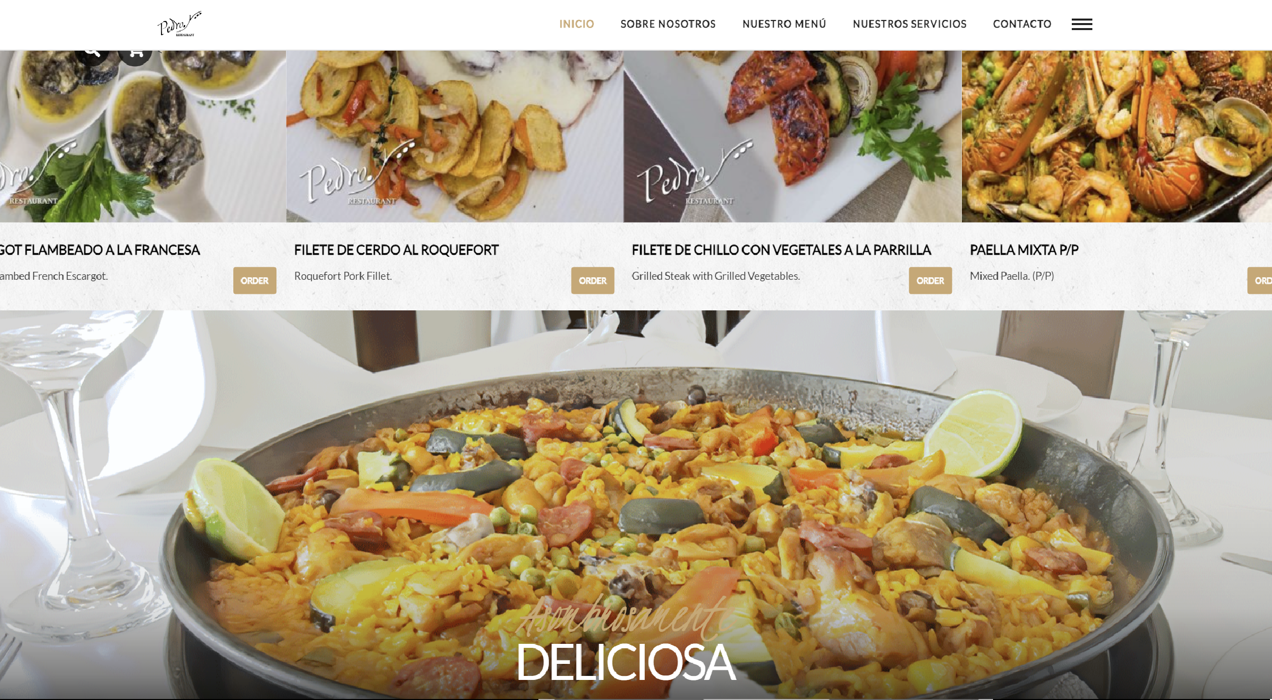
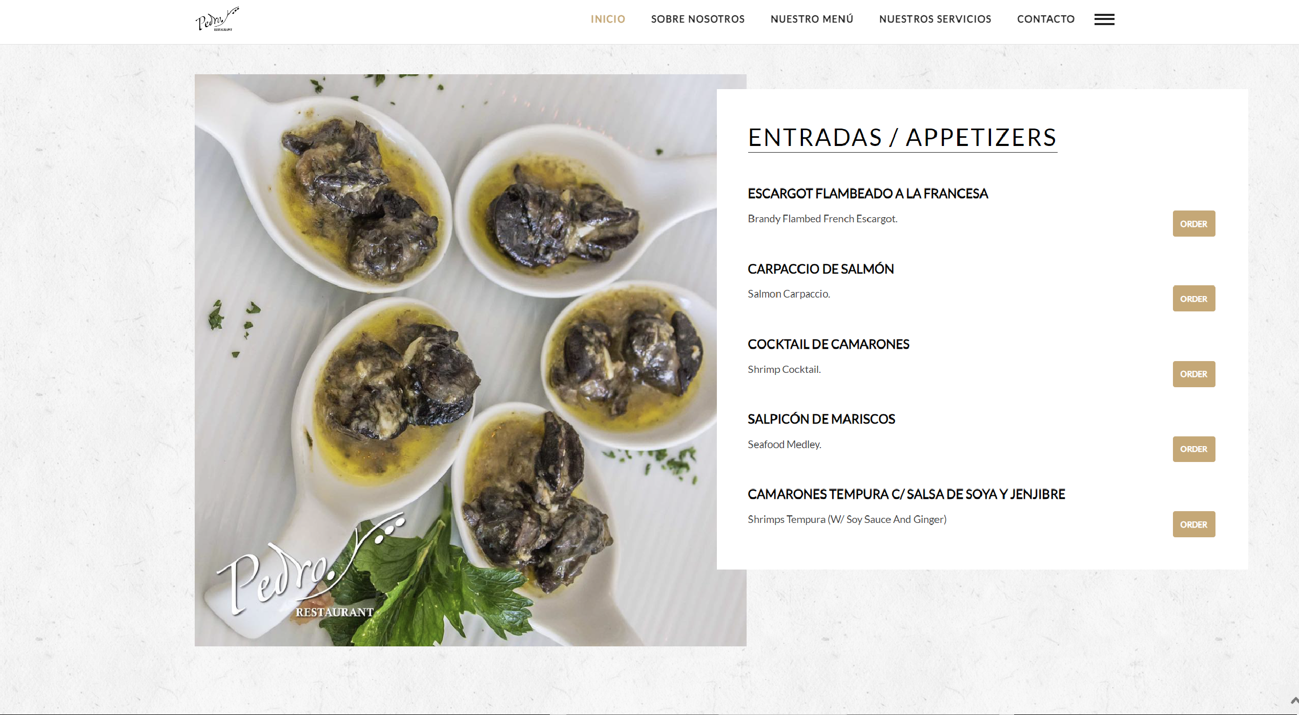
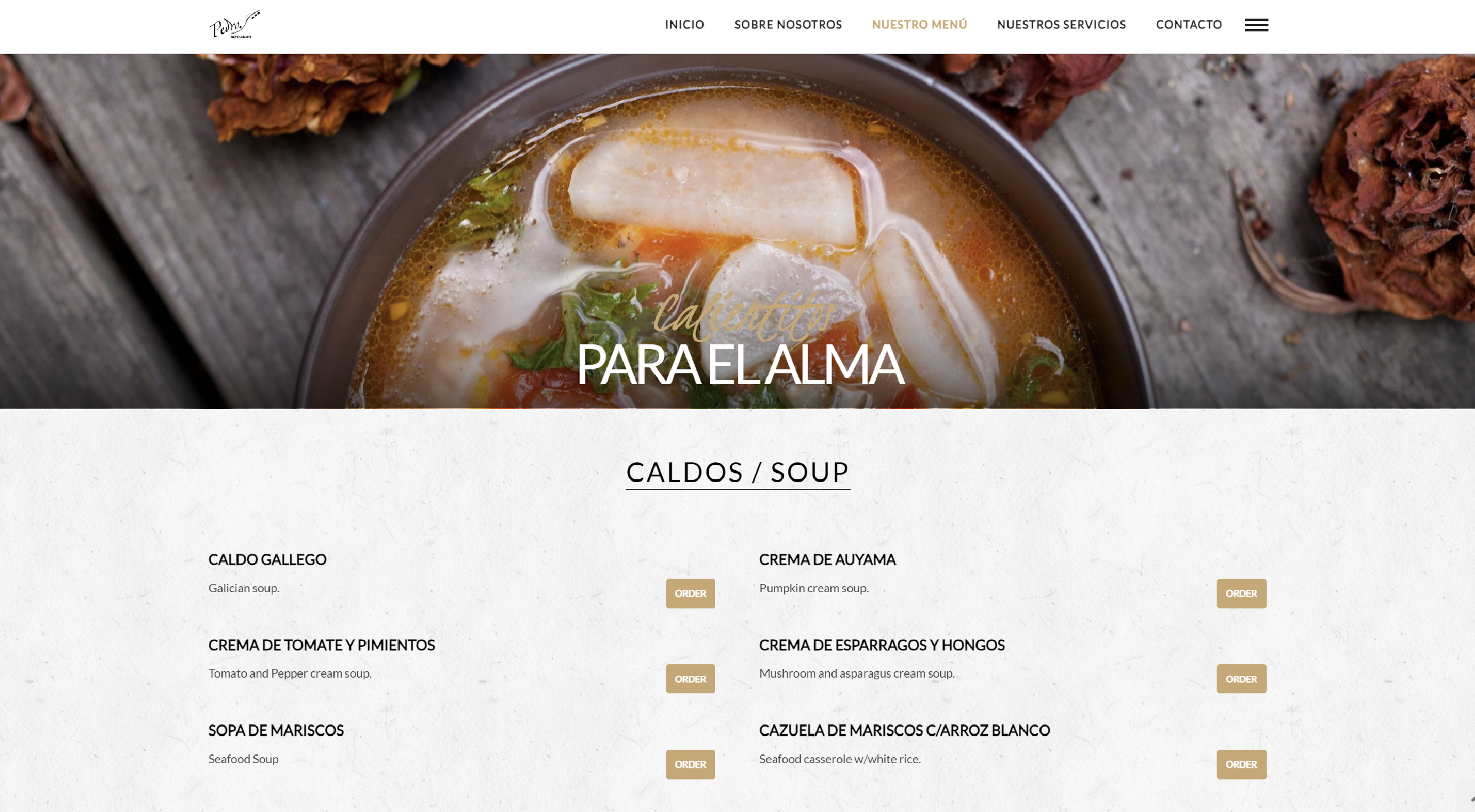
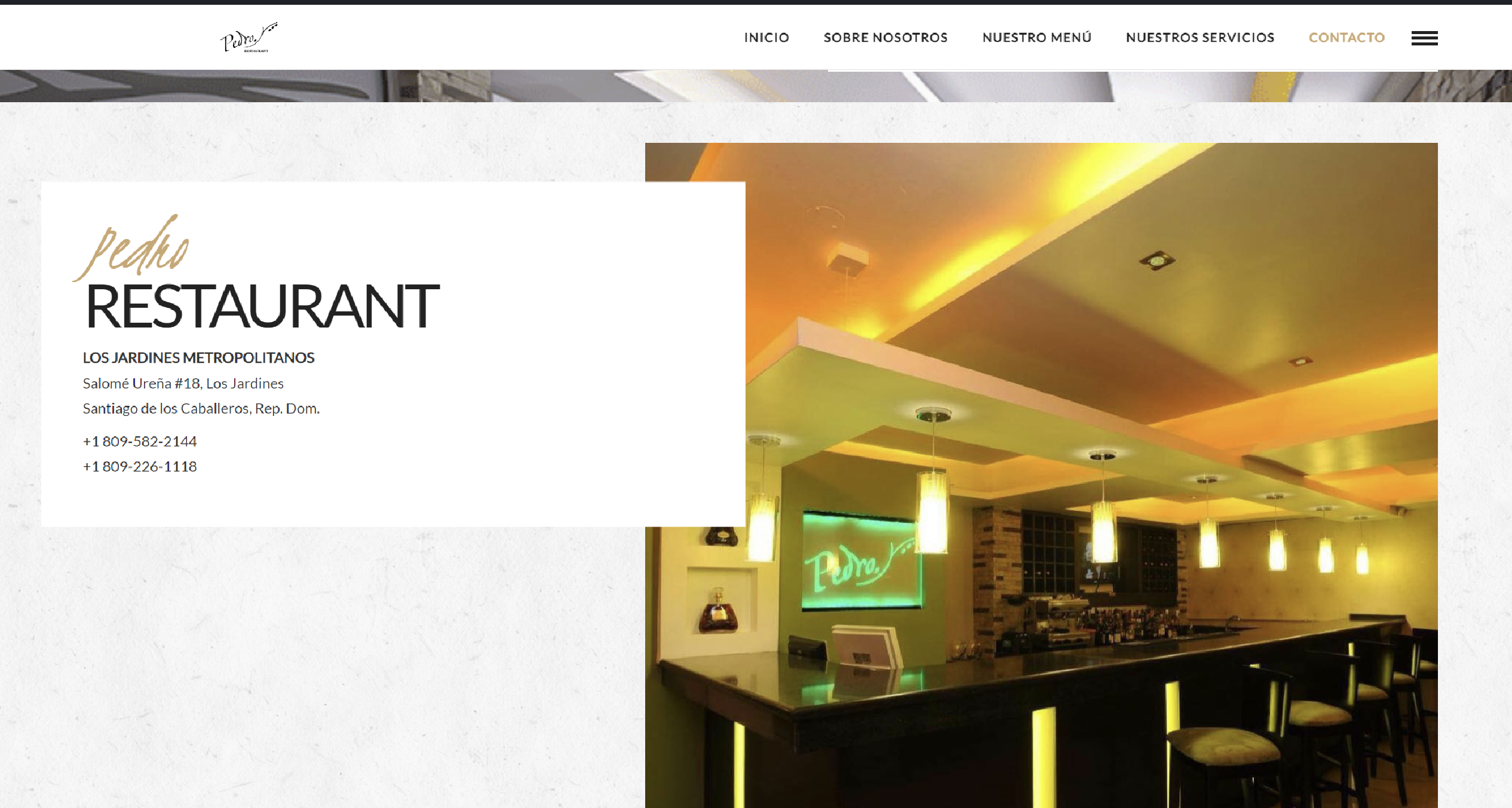
This gourmet restaurant, founded by renowned chef Pedro Gascón, offers an exceptional culinary experience in Santiago de los Caballeros. As the UI/UX Designer, Web Developer, Graphic Designer, and Marketing Strategist, I was responsible for creating the restaurant’s entire digital presence, from the website to the branding. This included designing the logo, producing high-quality photographs of signature dishes, and developing a marketing strategy to ensure a consistent flow of clientele.
Design Approach:
The design approach was centered on encapsulating the luxurious dining experience that the restaurant offers. I developed a visually captivating and user-friendly interface, highlighting the restaurant’s gourmet menu through vibrant images and sleek design elements that I personally created. The website design aimed to evoke the elegance and flavor of each dish, while providing an easy-to-navigate system for customers to explore the menu and make reservations.
Project Challenge:
The main challenge was to fully represent Pedro Gascón’s passion for culinary art and translate that into an immersive digital experience. It was critical to integrate both the fine dining ambiance and the seamless functionality of an online reservation system. The goal was to maintain a consistent customer base by ensuring that clients could easily reserve tables through the website.
Solution:
I implemented a comprehensive design solution, which included crafting all the graphic elements—from the logo to the dish photography. The responsive website features a reservation system that ensures the restaurant maintains consistent clientele by streamlining the booking process. I also designed a marketing strategy focusing on social media engagement, targeted advertisements, and search engine optimization, to increase visibility and drive customer traffic.
Design (UI/UX Design, Art Direction):
I implemented a responsive design that catered to the needs of different users, ensuring a seamless experience across mobile and desktop devices. The site features a clear and accessible navigation structure, integrating services such as account management, growth strategies, and account audits. Additionally, I optimized the website for fast load times and enhanced search engine visibility, which contributed to increased talent acquisition.

Marketing Strategy:
To keep the restaurant consistently busy, I implemented a robust marketing strategy that included digital ad campaigns and social media management. The strategy was designed to target both local and international food lovers, promoting the restaurant’s exclusive menu and reservation system. Regular updates on new dishes and events were shared, creating a strong connection with the clientele.
Results:
The website and marketing efforts successfully elevated the restaurant’s online presence, driving a significant increase in both reservations and customer engagement. The fully integrated reservation system has ensured a steady flow of clientele, while the visually appealing branding and design elements enhanced the overall perception of the restaurant as a premier dining destination in Santiago de los Caballeros.
Through a wide variety of mobile applications, we’ve developed a unique visual system and strategy that can be applied across the spectrum of available applications.
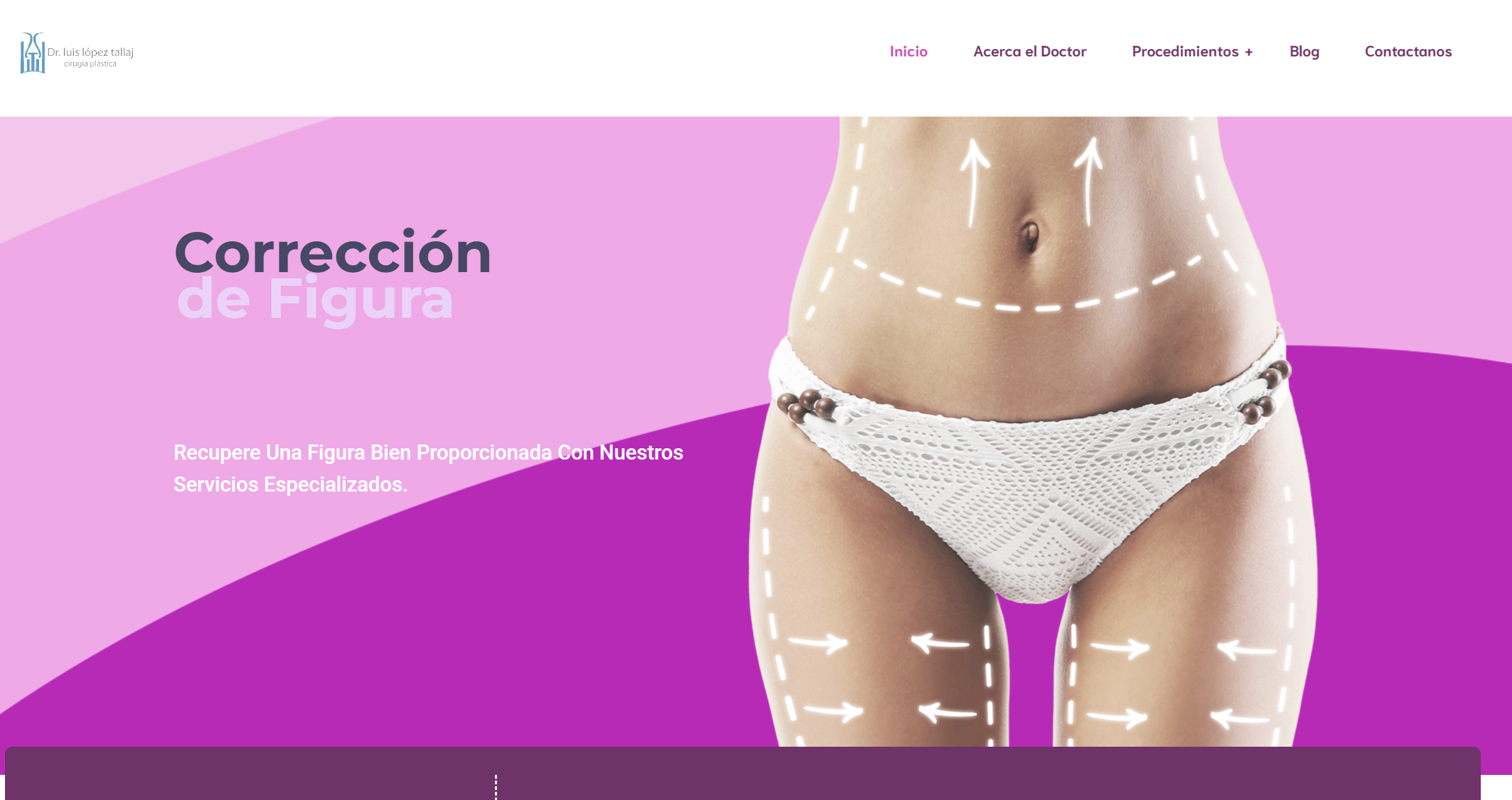
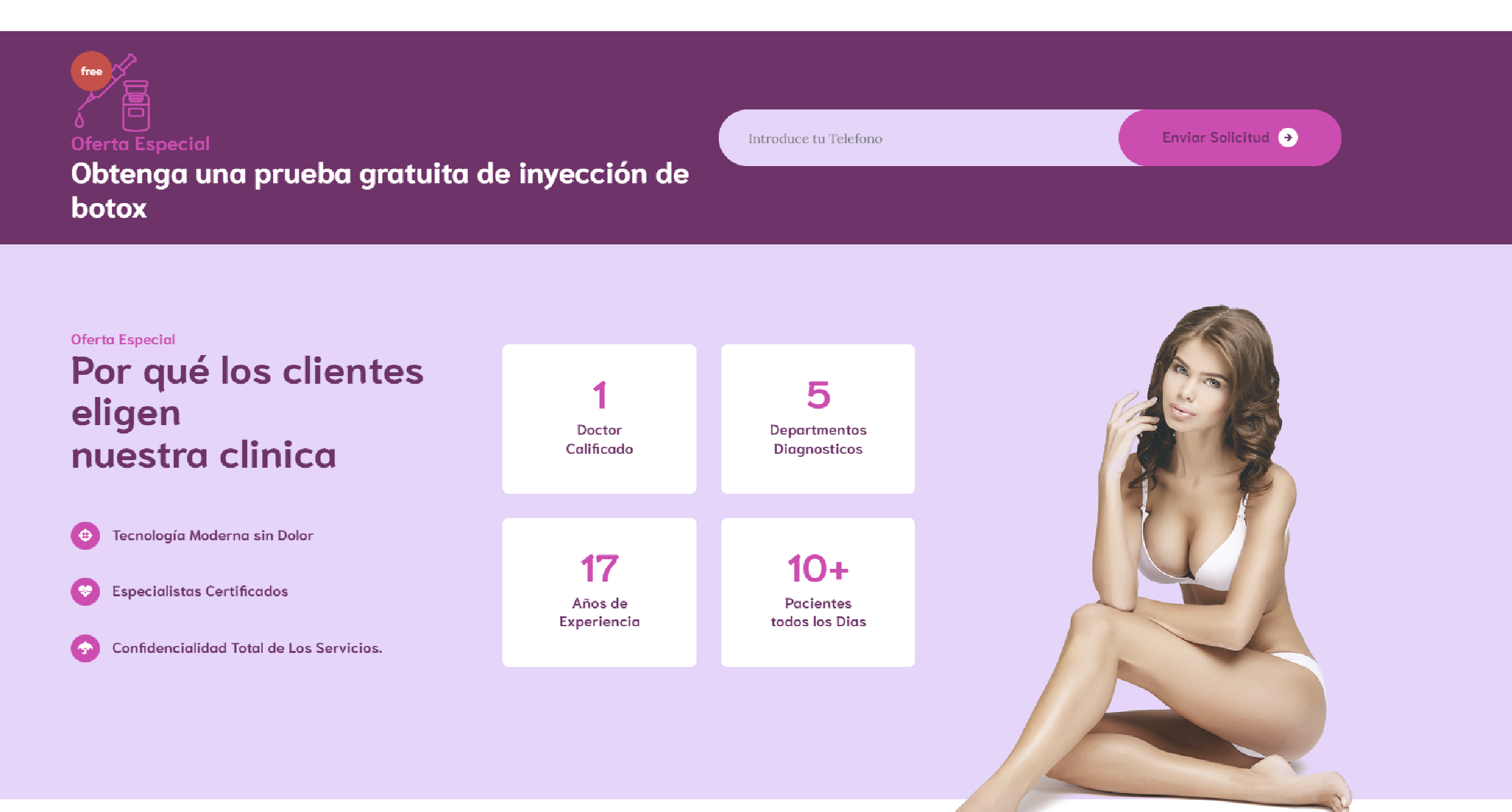
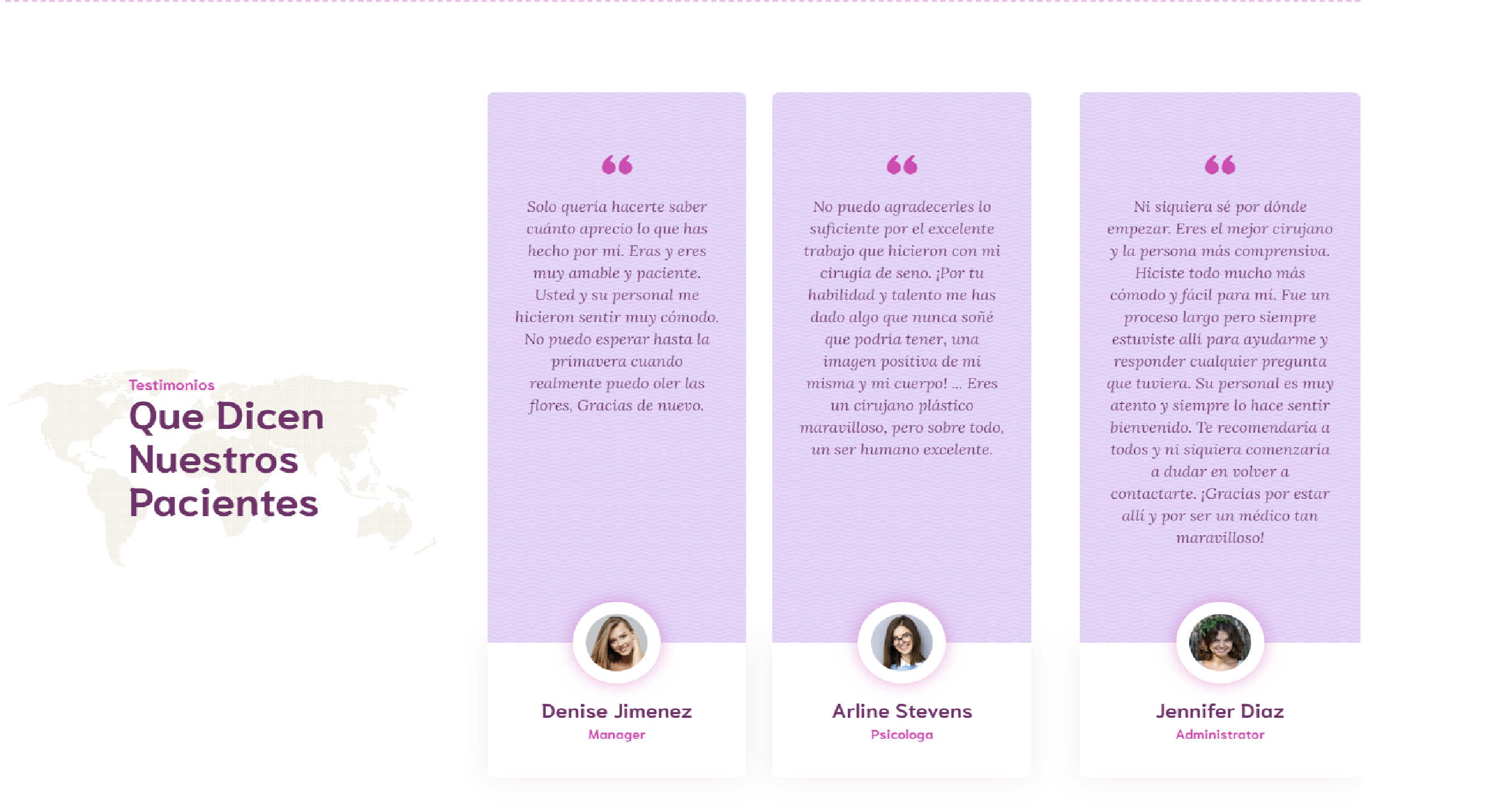
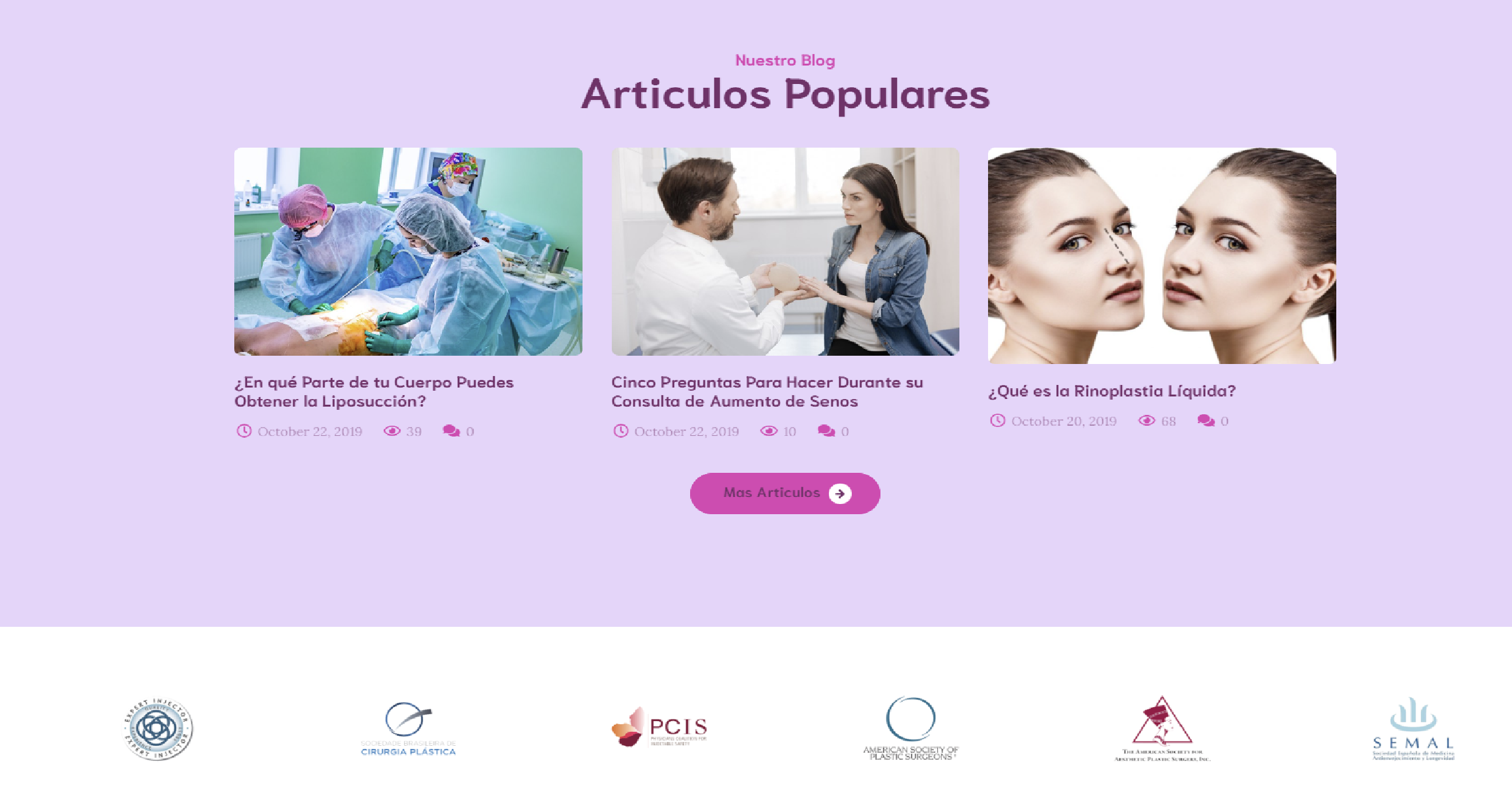
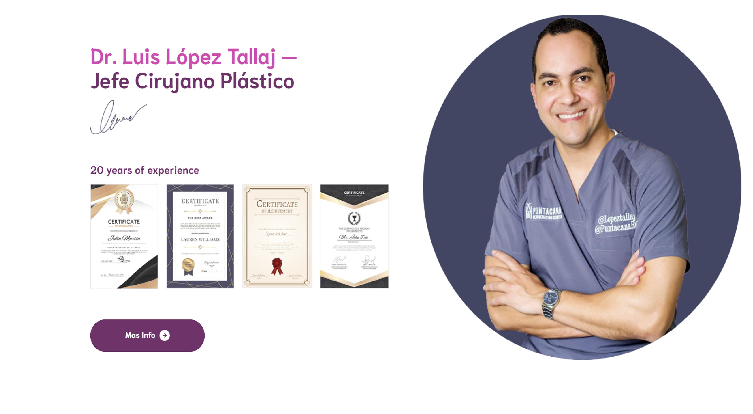
The Dr. Luis López Tallaj Surgery Center is one of the most renowned plastic surgery clinics in the Caribbean, specializing in advanced aesthetic procedures. As the UI/UX Designer and Web Developer, my role was to design and develop a digital platform that reflects the center’s excellence and expertise, providing a seamless and reliable experience for both potential patients and the medical team.
Design Approach:
The design focused on conveying professionalism, cutting-edge technology, and a client-friendly approach. I developed a clear and intuitive interface that allows patients to easily access detailed information about procedures, patient testimonials, and special offers. All visual designs, including photographs, graphics, logos, and the overall web structure, were created by me, ensuring a cohesive and visually appealing user experience.
Project Challenge:
The main challenge was to effectively communicate the broad range of services offered, from aesthetic surgeries to minimally invasive treatments, in a clear and accessible way. Additionally, the clinic required a platform that allowed users to easily schedule consultations, with fast navigation and a booking system that optimized the acquisition of new patients.
Solution:
I implemented a responsive and modern design that facilitates the exploration of the clinic’s services, highlighting special offers and patient testimonials. A reservation system was integrated to maintain a steady flow of clients. The website was optimized for SEO and fast load times, significantly improving its visibility in search engines.
Design (UI/UX Design, Art Direction):
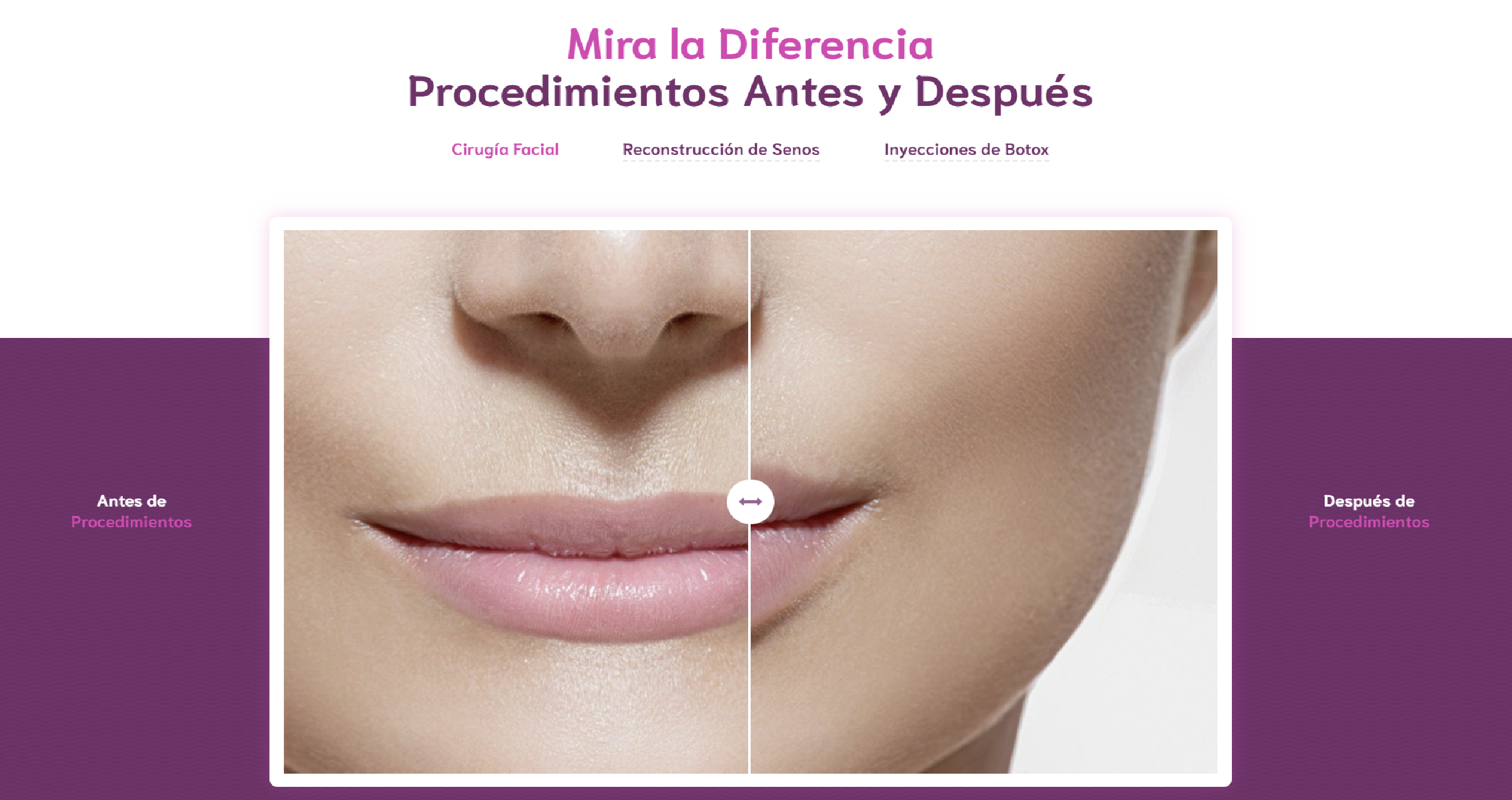
The visual design was created with a minimalist approach, using a neutral color palette to reflect the clinic’s elegance and professionalism. Before-and-after procedure images were prominently featured, along with satisfied patient testimonials, to reinforce trust in the services offered.
Marketing Strategy:
In addition to the web design, I also worked on the marketing strategy, ensuring the clinic’s online presence was aligned with its brand. I developed marketing visuals and graphics to promote special offers, patient testimonials, and success stories, which were distributed across various online platforms.
Results:
The new platform not only improved the clinic’s digital image but also significantly increased consultations and bookings through the integrated system. The clinic has experienced a notable increase in web traffic and new patient acquisition due to the website optimization and its attractive visual design.

I am available for work upon request. Connect with me via and call in to my account.
Phone: +1 928 364 1772 Email: topashx1x@gmail.com