Logo Designs
Through a wide variety of mobile applications, we’ve developed a unique visual system and strategy that can be applied across the spectrum of available applications.
When it comes to my design skills, I have a strong command of various visual styles and techniques. My creations are highly adaptable to the needs of different brands, whether they focus on the natural and organic or the modern and technological.

Client: SheBe Agency
For this logo, I wanted to convey professionalism and trust through a modern and clean style. “SHEBE” is written in vibrant blue and in uppercase to instantly capture attention, while “Agency” is set in a lighter, more elegant typeface to create an interesting contrast that reinforces the agency’s creativity and flexibility. This visual combination is ideal for brands or agencies looking to project a fresh, modern, and approachable image, without losing the professional touch.
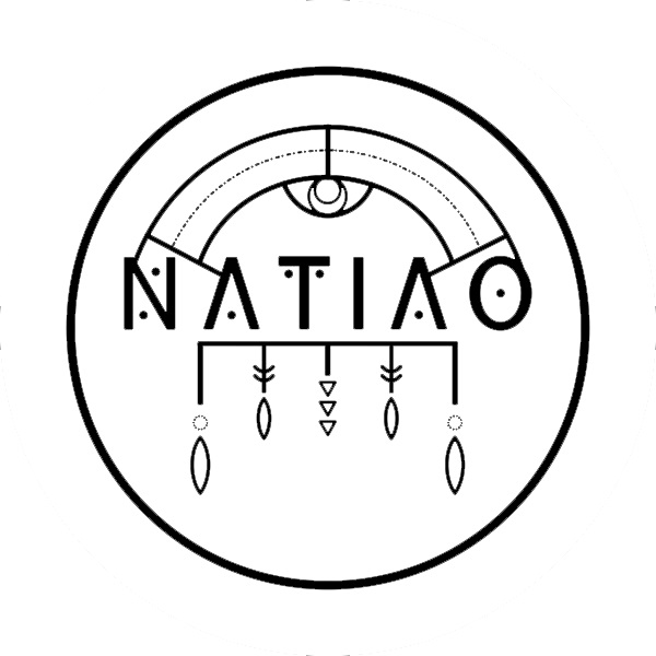
Client: NATIAO
The design I created for “NATIAO” is inspired by indigenous or traditional cultural elements, showcasing a clear focus on art and symbolism.
The circular structure and geometric details add a touch of mystery and depth, while the choice of black and white gives it a timeless and classic feel. With this logo, I wanted to honor the brand’s cultural roots, promoting a connection with the past and its traditions.

I enjoy working with customized typography and strategically playing with colors to create a strong and cohesive visual identity. Additionally, my logos are characterized by their simplicity, ensuring they are versatile and easy to apply across any medium, whether digital or print.

Client: Asociacion de Medios Privados
For this logo, I wanted to convey professionalism and trust through a modern and clean style. “SHEBE” is written in vibrant blue and in uppercase to instantly capture attention, while “Agency” is set in a lighter, more elegant typeface to create an interesting contrast that reinforces the agency’s creativity and flexibility. This visual combination is ideal for brands or agencies looking to project a fresh, modern, and approachable image, without losing the professional touch.
Client: Gentlemen’s Spa
This logo conveys calm and sophistication at first glance. The image of a man in a relaxed posture, along with the soft golden curve, evokes tranquility and luxury. The choice of elegant and modern black typography reflects exclusivity, while the slogan in gold adds a premium touch. This design is clearly aimed at a male clientele, seeking to project a high-quality spa experience focused on wellness and personal care.


Client: Nut’s and More
This logo reflects my focus on the organic and natural, perfect for a brand centered on sustainable or agricultural products. In the design, I represent a macadamia nut in a minimalist style with an orange color, highlighting the brand’s core product. By choosing fonts that blend modern and handcrafted styles, I use cursive and handwritten fonts that evoke a sense of closeness. The green and black colors add a touch of freshness and elegance. Through this logo, I aim to communicate a connection between nature, sustainability, and the brand’s customers.
Client: Find Only Dimes
The logo for this brand is bold and attention-grabbing, designed to immediately catch the eye. The use of a bright pink tone with graphic elements, such as a devil’s tail wrapped around the letter “O”, adds a playful and rebellious feel. This design fits a daring, modern brand, possibly linked to entertainment or a youthful community. The combination of strong black typography with the bold, feminine touch of pink creates a visual contrast that highlights the brand’s unique essence.


